Metropoly User Manual
Introduction
Guide introduction
In this user guide you will find all required information to get your site up. It is mainly introducing how to get setup with the theme, use WordPress theme Metropoly to make one-page and multi-page site and change demo date to what you need. Specific description of the various functional modules, features and principles, theme related questions and bugs or issues that occur when using the theme.
WordPress Theme Metropoly
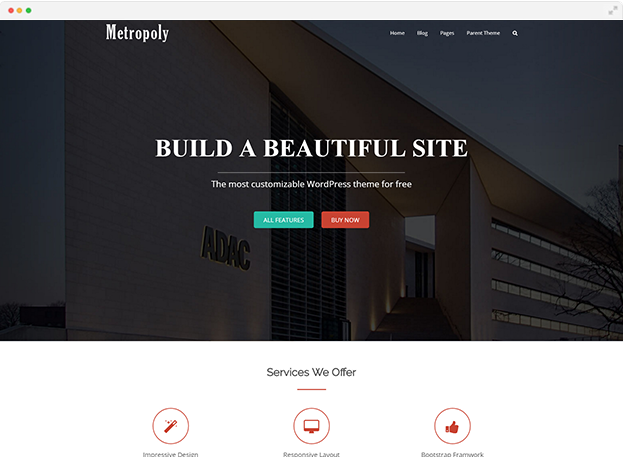
WordPress is most likely to be the first platform that many take into consideration when setting up a website. It is a general trend in the world now. Metropoly, featured all the features of a wonderful theme, a showcase of what’s possible with the MageeWP theme based on the advanced network of options. Built-in Magee Page Builder makes it easy to create responsive column based content, gives you complete flexibility. Metropoly itself is also built to demonstrate how flexible your website can be.
Compatibility
Metropoly is compatible with the WordPress version 4.0 and later (PHP v.5.2.4 or greater. MySQL v.5.0.15 or greater). Most JavaScript enabled browsers will make our themes work with no issues. They are designed and optimized for desktops, tablets and smartphones. Currently we are testing themes in
- Google Chrome (Mac and PC)
- Firefox (Mac and PC)
- Internet Explorer 10 and later (also, we’re making sure that site remains readable in IE 9)
- Safari (Mac and PC)
- Opera (based on Blink/Chromium engine; Mac and PC)
- Safari Mobile
- Chrome (on iOS and Android)
Installation
Free Version Installation
Method 1. Download from WordPress.Org
Step 1
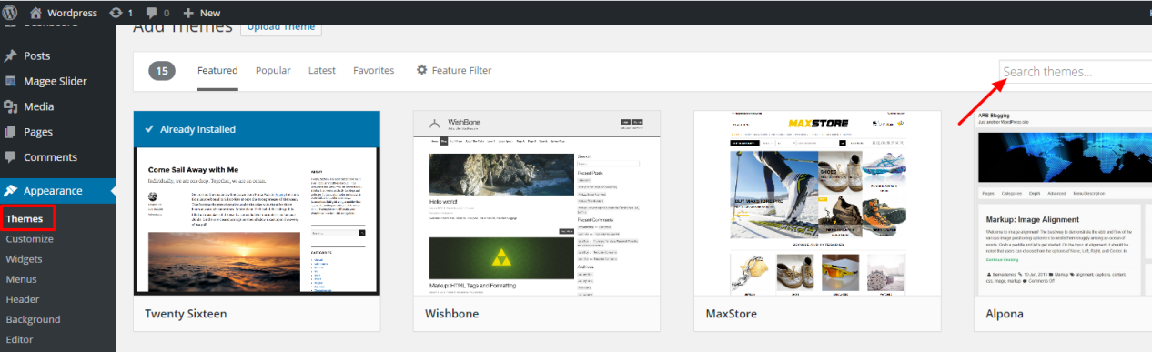
Go to Appearance> Themes, click on Add New, search Metropoly.

Step 2
When the Metropoly theme appears, click Install button, then the WordPress will start downloading the theme.
Step 3
Active the theme
Method 2. Upload the Installable Theme File
Step 1
Download the theme from wordpress.org or Mageewp.Com
Step 2
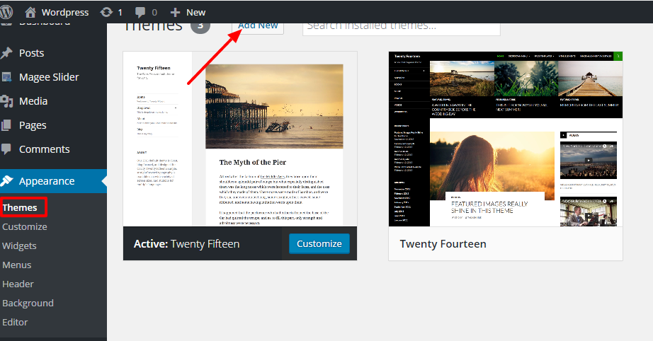
Go to Appearance> Themes in the Dashboard, Click on the Add New button
Step 3
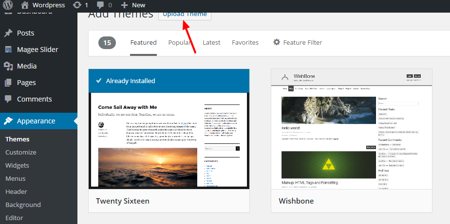
Click on Upload Theme
Step 4
Select the file you have downloaded before, Click Install Now
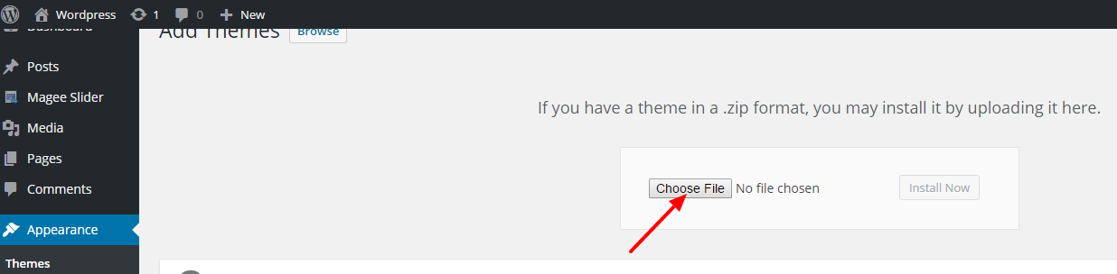
Step 5
Hit Activate to activate the theme after it is successfully uploaded
Magee Page Builder Plugin
Magee Page Builder is WordPress plugin that provides custom post types. It makes it easy to create responsive column based content, using the widgets you know and love. After activate the free version Metropoly theme, you will see the tip on the top of Appearance/Themes. To keep Metropoly a better function, the plugin Magee Page Builder is definitely required.
Just click ‘Begin activating plugin’.
Home Page
Home Page Setting
Step 1
Create a new page by navigating to the ‘Pages’ tab in your WordPress admin sidebar. Once here, click the ‘Add New’ button at the top of the page.

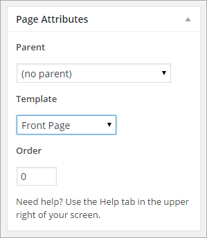
Step 2
Input a new name for your page, then find the ‘Page Attributes’ box on right side. Under the Template section, select the ‘Front Page’ option from the dropdown list.
Step 3
Setting up your home page is the same as setting up any other regular pages, except that you need to specify in the settings which page will be your Main Home Page.
- Navigate to Dashboard > Settings > Reading interface.
- In the ‘Front page displays’ section choose ‘static page(select below)’ radio-button.
- In the ‘Front page’ selector choose the page you want to be the Homepage from the Front Page dropdown list.
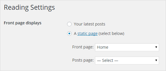
Save changes and the Metropoly homepage will then display.
Home Page Options
Go to Dashboard>Appearance>Customize, click Customize, you will see option set in the left side of the front end.
Attention
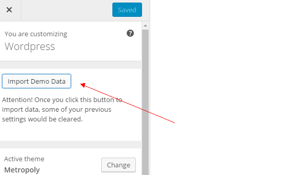
Once you have installed Magee Page Builder plugin, click ‘Import Demo Data’ to save some settings by gaining default setting convenience. Since some of your previous settings would be cleared, do make this your first move of customization.
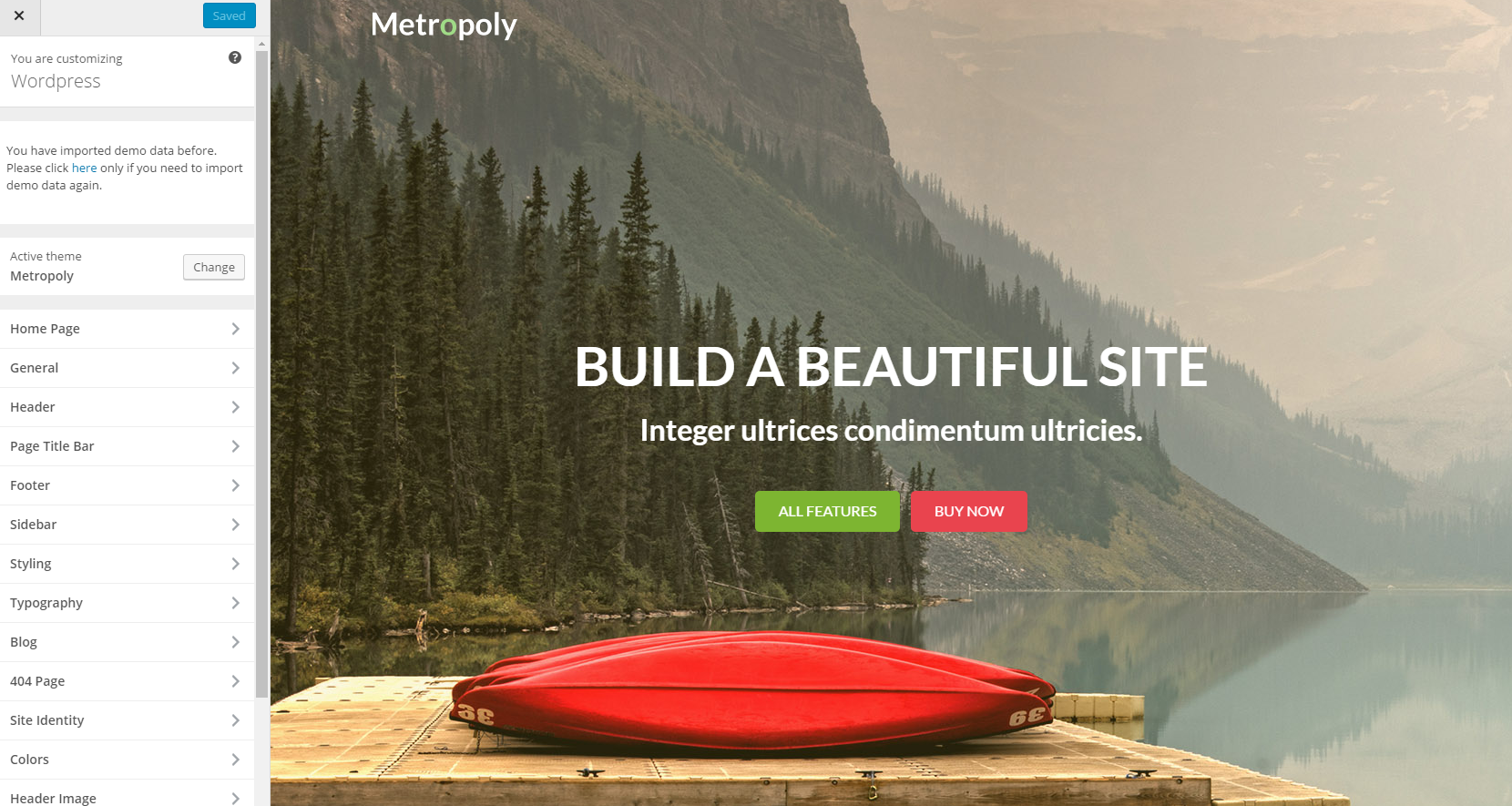
Click Home Page in the customize, you will be able to edit the sections of the Metropoly homepage, like banner, slogan, service and so on.
General
Enable Home Page Animation
Home Page Animation means animation visual effects showcased with home page open. You can choose whether to enable Home Page Animation or not by YES or NO in the section below.
Home Page Section - Banner
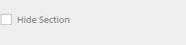
Hide Section
Check this checkbox Hide Section, the whole slider section would be hide from the homepage, be careful when you check it.
Slider
To catch your viewers attention by displaying your important content, you can select a slider of slide items to display here..
Select a slider of slide items to display here. You need to create slides and choose a same slider for them first.
Step 1
Go to Dashboard>Appearance>Customize
Step 2
Navigate to Homepage > Section-Banner
Step 3
Scroll down to slide part, Check this checkbox ‘Display Slide 1/2/3/4/5’ to enable the slide.
Global Options
Background Image
You can choose to keep the defaulted image or upload background image for this slide.
Slide Title/ Subtitle
Input Slide Title/ Subtitle in the appointed sections below.
Left/ Right Button Text / Link
Metropoly offered a defaulted button on the section, you can choose whether to showcase it or not.
eg. Activate the button
Input characters you want it present into Button Text section.
You can also add a link in the Button link section, that’s when you click the button, it will turn to where your added link points to(set whether you want the link target open in a new window or stay on the same window by Button Link Target drop down list).
eg. Deactivate the button
Just keep the Button Text section blank.
Section ID
This id is used for advanced custom css or codes, if you are not good at that, just keep it default.
NOTICE
Once style changed, you need to click Save & Publish button and refresh the page to apply the change.
Home Page Section - Service
This section is designed for you to introduce the services from your company, the features of your product, etc.
Hide Section
Check this checkbox Hide Section, the whole slider section would be hide from the homepage, be careful when you check it.
Background Color/Image
eg. 1
Set Background Color
If you want no background image for this section, you can set Background color for it.
Step 1
Go to Dashboard>Appearance>Customize
Step 2
Navigate to Homepage > Section-Service
Step 3
Scroll down to Background Color part, Click ‘Select Color’
Step 4
Drag the circle with your mouse, choose a color. If you have a particular color in mind, you can instead add the unique hexcode in field provided. (you can also control the transparency of your chosen color by moving the rightmost slider up or down)
eg. 2
Set Background Image
Step 1
Go to Dashboard>Appearance>Customize
Step 2
Navigate to Homepage > Section-Service
Step 3
Go to Homepage image part, Click ‘Select File’
Step 4
Select files (you can upload files from your computer or you can simply choose one from the media library)
In this way you can no longer set background color, since background image can overlay background color.
Section Padding
Change Section Top/Bottom Padding by input numbers in pixels respectively.
Title
Input Title in the appointed sections below.
Columns
Metropoly offers three kinds of columns for you to choose from. You can decide by the number of your services.
Font Awesome Icon/ Feature Box
Metropoly offers 6 Feature Boxes for usage. You can set them one by one.
Font Awesome Icon
Input icon name or you can upload icon by yourself.
Service Content
Choose one corresponding page from the dropdown list.
Title Link/ Link Target
You can also add a link in the Title link section, that’s when you click the button, it will turn to where your added link points to(set whether you want the link target open in a new window or stay on the same window by Link Target drop down list).
Tips
Feature Boxes all worked respectively. Do remember to match numbers of it when you edit this section.
Section ID
This id is used for advanced custom css or codes, if you are not good at that, just keep it default.
Home Page Section - Recent Works
Hide Section
Check this checkbox Hide Section, the whole slider section would be hide from the homepage, be careful when you check it.
Background Color/Image
eg. 1
Set Background Color
If you want no background image for this section, you can set Background color for it.
Step 1
Go to Dashboard>Appearance>Customize
Step 2
Navigate to Homepage > Section-Slider
Step 3
Scroll down to Background Color part, Click ‘Select Color’
Step 4
Drag the circle with your mouse, choose a color. If you have a particular color in mind, you can instead add the unique hexcode in field provided. (you can also control the transparency of your chosen color by moving the rightmost slider up or down)
eg. 2
Set Background Image
Step 1
Go to Dashboard>Appearance>Customize
Step 2
Navigate to Homepage > Section-Slider
Step 3
Go to Homepage image part, Click ‘Select File’
Step 4
Select files (you can upload files from your computer or you can simply choose one from the media library)
In this way you can no longer set background color, since background image can overlay background color.
Section Padding
Change Section Top/Bottom Padding by input numbers in pixels respectively.
Title
Input Title in the appointed sections below.
Columns
Metropoly offers three kinds of columns for you to choose from. You can decide by the number of your services.
Featured Image
Metropoly offers 8 Image Boxes for usage. You can set them one by one.
Featured Image
Display page featured image by choosing one corresponding page from the dropdown list.
Link Target
Set whether you want the link target open in a new window or stay on the same window by Link Target drop down list.
Tips
Image Boxes all worked respectively. Do remember to match numbers of it when you edit this section.
Button Text / Link
Metropoly offered a defaulted button on the recent works section, you can choose whether to showcase it or not.
eg.
Activate the button
Input characters you want it present into Button Text section.
You can also add a link in the Button link section, that’s when you click the button, it will turn to where your added link points to(set whether you want the link target open in a new window or stay on the same window by Button Link Target drop down list).
eg.
Deactivate the button
Just keep the Button Text section blank.
Section ID
This id is used for advanced custom css or codes, if you are not good at that, just keep it default.
NOTICE
Once style changed, you need to click Save & Publish button and refresh the page to apply the change.
Home Page Section - Features
Hide Section
Check this checkbox Hide Section, the whole slider section would be hide from the homepage, be careful when you check it.
Background Color/Image
eg. 1
Set Background Color
If you want no background image for this section, you can set Background color for it.
Step 1
Go to Dashboard>Appearance>Customize
Step 2
Navigate to Homepage > Section-Features
Step 3
Scroll down to Background Color part, Click ‘Select Color’
Step 4
Drag the circle with your mouse, choose a color. If you have a particular color in mind, you can instead add the unique hexcode in field provided. (you can also control the transparency of your chosen color by moving the rightmost slider up or down)
eg. 2
Set Background Image
Step 1
Go to Dashboard>Appearance>Customize
Step 2
Navigate to Homepage > Section-Features
Step 3
Go to Homepage image part, Click ‘Select File’
Step 4
Select files (you can upload files from your computer or you can simply choose one from the media library)
In this way you can no longer set background color, since background image can overlay background color.
Section Padding
Change Section Top/Bottom Padding by input numbers in pixels respectively.
Title
Input Title in the appointed sections below.
Image
Input image link in the appointed sections below.
Font Awesome Icon/ Feature Box
Metropoly offers 6 Feature Boxes for usage. You can set them one by one.
Font Awesome Icon
Input icon name or you can upload icon by yourself.
Feature Box Content
Choose one corresponding page from the dropdown list.
Title Link/ Link Target
You can also add a link in the Title link section, that’s when you click the button, it will turn to where your added link points to(set whether you want the link target open in a new window or stay on the same window by Link Target drop down list).
Tips
Image Boxes all worked respectively. Do remember to match numbers of it when you edit this section.
Section ID
This id is used for advanced custom css or codes, if you are not good at that, just keep it default.
NOTICE
Once style changed, you need to click Save & Publish button and refresh the page to apply the change.
Home Page Section - Panels
Hide Section
Check this checkbox Hide Section, the whole slider section would be hide from the homepage, be careful when you check it.
Background Color/Image
eg. 1
Set Background Color
If you want no background image for this section, you can set Background color for it.
Step 1
Go to Dashboard>Appearance>Customize
Step 2
Navigate to Homepage > Section-Panels
Step 3
Scroll down to Background Color part, Click ‘Select Color’
Step 4
Drag the circle with your mouse, choose a color. If you have a particular color in mind, you can instead add the unique hexcode in field provided. (you can also control the transparency of your chosen color by moving the rightmost slider up or down)
eg. 2
Set Background Image
Step 1
Go to Dashboard>Appearance>Customize
Step 2
Navigate to Homepage > Section-Panels
Step 3
Go to Homepage image part, Click ‘Change File’
Step 4
Select files (you can upload files from your computer or you can simply choose one from the media library)
In this way you can no longer set background color, since background image can overlay background color.
Section Padding
Change Section Top/Bottom Padding by input numbers in pixels respectively.
Title
Input Title in the appointed sections below.
Section ID
This id is used for advanced custom css or codes, if you are not good at that, just keep it default.
Left/ Right Box Content
Input content.
Left/ Right Button Text
Input Text.
Left/ Right Button Link/ Link Target
You can also add a link in the Title link section, that’s when you click the button, it will turn to where your added link points to(set whether you want the link target open in a new window or stay on the same window by Link Target drop down list).
NOTICE
Once style changed, you need to click Save & Publish button and refresh the page to apply the change.
Section 7
Home Page Section - Our Team
The section mainly introduces your team to the public and shows your teammate to promote your business.
Hide Section
Check this checkbox Hide Section, the whole slider section would be hide from the homepage, be careful when you check it.
Background Color/Image
eg. 1
Set Background Color
If you want no background image for this section, you can set Background color for it.
Step 1
Go to Dashboard>Appearance>Customize
Step 2
Navigate to Homepage > Section-Our Team
Step 3
Scroll down to Background Color part, Click ‘Select Color’
Step 4
Drag the circle with your mouse, choose a color. If you have a particular color in mind, you can instead add the unique hexcode in field provided. (you can also control the transparency of your chosen color by moving the rightmost slider up or down)
eg. 2
Set Background Image
Step 1
Go to Dashboard>Appearance>Customize
Step 2
Navigate to Homepage > Section-Our Team
Step 3
Go to Homepage image part, Click ‘Select File’
Step 4
Select files (you can upload files from your computer or you can simply choose one from the media library)
In this way you can no longer set background color, since background image can overlay background color.
Section Padding
Change Section Top/Bottom Padding by input numbers in pixels respectively.
Title
Input Title in the appointed sections below.
Columns
Metropoly offers three kinds of columns for you to choose from. You can decide by the number of your team members.
Member
Display featured image, title and excerpt by choosing one corresponding page from the dropdown list.
Byline
Just input relevant message in appointed sections below.
Social Icon
Input icon name and relevant icon link one by one (4 at most).
Tips
Avatar Boxes all worked respectively. Do remember to match numbers of it when you edit this section.
Section ID
This id is used for advanced custom css or codes, if you are not good at that, just keep it default.
NOTICE
Once style changed, you need to click Save & Publish button and refresh the page to apply the change.
Home Page Section - Testimonials
The section mainly displays the feedback from your customer.
Hide Section
Check this checkbox Hide Section, the whole slider section would be hide from the homepage, be careful when you check it.
Background Color/Image
eg. 1
Set Background Color
If you want no background image for this section, you can set Background color for it.
Step 1
Go to Dashboard>Appearance>Customize
Step 2
Navigate to Homepage > Section-Testimonials
Step 3
Scroll down to Background Color part, Click ‘Select Color’
Step 4
Drag the circle with your mouse, choose a color. If you have a particular color in mind, you can instead add the unique hexcode in field provided. (you can also control the transparency of your chosen color by moving the rightmost slider up or down)
eg. 2
Set Background Image
Step 1
Go to Dashboard>Appearance>Customize
Step 2
Navigate to Homepage > Section-Testimonials
Step 3
Go to Homepage image part, Click ‘Select File’
Step 4
Select files (you can upload files from your computer or you can simply choose one from the media library)
In this way you can no longer set background color, since background image can overlay background color.
Section Padding
Change Section Top/Bottom Padding by input numbers in pixels respectively.
Title
Input Title in the appointed sections below.
Columns
Metropoly offers three kinds of columns for you to choose from. You can decide by the number of your team members.
Member
Display featured image, title and excerpt by choosing one corresponding page from the dropdown list.
Byline
Just input relevant message in appointed sections below.
Section ID
This id is used for advanced custom css or codes, if you are not good at that, just keep it default.
NOTICE
Once style changed, you need to click Save & Publish button and refresh the page to apply the change.
Home Page Section - Latest News
The section mainly displays the feedback from your customer.
Hide Section
Check this checkbox Hide Section, the whole slider section would be hide from the homepage, be careful when you check it.
Background Color/Image
eg. 1
Set Background Color
If you want no background image for this section, you can set Background color for it.
Step 1
Go to Dashboard>Appearance>Customize
Step 2
Navigate to Homepage > Section-Latest News
Step 3
Scroll down to Background Color part, Click ‘Select Color’
Step 4
Drag the circle with your mouse, choose a color. If you have a particular color in mind, you can instead add the unique hexcode in field provided. (you can also control the transparency of your chosen color by moving the rightmost slider up or down)
eg. 2
Set Background Image
Step 1
Go to Dashboard>Appearance>Customize
Step 2
Navigate to Homepage > Section-Latest News
Step 3
Go to Homepage image part, Click ‘Select File’
Step 4
Select files (you can upload files from your computer or you can simply choose one from the media library)
In this way you can no longer set background color, since background image can overlay background color.
Section Padding
Change Section Top/Bottom Padding by input numbers in pixels respectively.
Title
Input Title in the appointed sections below.
Columns
Metropoly offers three kinds of columns for you to choose from. You can decide by the number of your team members.
Posts Num
Set number of posts you wanna showcase on the homepage by the Post Num dropdown list.
Section ID
This id is used for advanced custom css or codes, if you are not good at that, just keep it default.
NOTICE
Once style changed, you need to click save & publish button and refresh the page to apply the change.
Home Page Section - Partners
1. Content Model- Default
Choose Default to fill this section form with fixed layout.
1.1 Content Model - Default - Color
eg.
Set font color for this section
Step 1
Go to Dashboard>Appearance>Customize
Step 2
Navigate to Homepage > Section-Partners
Step 3
Scroll down to Color part, Click ‘Select Color’
Step 4
Drag the circle with your mouse, choose a color. If you have a particular color in mind, you can instead add the unique hexcode in field provided. (you can also control the transparency of your chosen color by moving the rightmost slider up or down)
1.2 Content Model - Default - Background Color
Step 1
Go to Dashboard>Appearance>Customize
Step 2
Navigate to Homepage > Section-Partners
Step 3
Scroll down to Background Color part, Click ‘Select Color’
Step 4
Drag the circle with your mouse, choose a color. If you have a particular color in mind, you can instead add the unique hexcode in field provided. (you can also control the transparency of your chosen color by moving the rightmost slider up or down)
Tips
Metropoly offers default background color for this section, once you are puzzled about color setting, just click ‘default’ on the right side.
1.3 Content Model - Default - Background Image
Unlike Banner section, there is no defaulted Background Image, you can set whether Background Image or Background color.
Step 1
Go to Dashboard>Appearance>Customize
Step 2
Navigate to Homepage > Section-Partners
Step 3
Go to Background image part, Click ‘Select File’
Step 4
Select files (you can upload files from your computer or you can simply choose one from the media library)
In this way you can no longer set background color, since background image can overlay background color.
1.4 Content Model - Default - Section Padding
Change Section Top/Bottom Padding by input numbers in pixels respectively.
1.5 Content Model - Default - Title / Tooltip Title
Input Title and Tooltip Title in the appointed sections below.
1.6 Content Model - Default - Image
1.6.1 Upload Image/ Link
Set promotion images of your partners in this part. You can also add a link to the image in the Link section (5 images at most).
1.7 Content Model - Default - Section ID
This id is used for advanced custom css or codes, if you are not good at that, just keep it default.
2. Content Model- Custom
Users can also define their own style instead of fixed layout by setting Content Model as Custom. HTML Code and Shortcode are allowed.
NOTICE
Do remember, once Content Model is set as Custom, you can no longer get all changes done by previous options. If you are not good at html code, we recommend you the Default model, since it is well designed and can meet multiple needs, surely would be helpful for you.
Tips
Scroll down to the end you will see one checkbox like this.
Check this checkbox Hide Section, the whole service section would be hide from the homepage, be careful when you check it.
NOTICE
Once style changed, you need to click save & publish button and refresh the page to apply the change.
Home Page Section - Slogan
This section is designed for you to introduce the services from your company, the features of your product, etc.
Hide Section
Check this checkbox Hide Section, the whole slider section would be hide from the homepage, be careful when you check it.
Background Color/Image
eg. 1
Set Background Color
If you want no background image for this section, you can set Background color for it.
Step 1
Go to Dashboard>Appearance>Customize
Step 2
Navigate to Homepage > Section-Slogan
Step 3
Scroll down to Background Color part, Click ‘Select Color’
Step 4
Drag the circle with your mouse, choose a color. If you have a particular color in mind, you can instead add the unique hexcode in field provided. (you can also control the transparency of your chosen color by moving the rightmost slider up or down)
eg. 2
Set Background Image
Step 1
Go to Dashboard>Appearance>Customize
Step 2
Navigate to Homepage > Section-Slogan
Step 3
Go to Homepage image part, Click ‘Select File’
Step 4
Select files (you can upload files from your computer or you can simply choose one from the media library)
In this way you can no longer set background color, since background image can overlay background color.
Section Padding
Change Section Top/Bottom Padding by input numbers in pixels respectively.
Title
Input Title in the appointed sections below.
Button Text / Link
Metropoly offered a defaulted button on this section, you can choose whether to showcase it or not.
eg.
Activate the button
Input characters you want it present into Button Text section
You can also add a link in the Button link section, that’s when you click the button, it will turn to where your added link points to(set whether you want the link target open in a new window or stay on the same window by Button Link Target drop down list).
eg.
Deactivate the button
Just keep the Button Text section blank.
Section ID
This id is used for advanced custom css or codes, if you are not good at that, just keep it default.
NOTICE
Once style changed, you need to click Save & Publish button and refresh the page to apply the change.
Theme Options
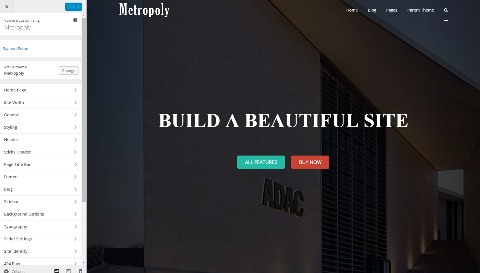
Metropoly is managed through a network of options located in Dashboard > Appearance > Customize, click Customize, and you will see option set in the left side of the front end.
NOTICE
These options are all global options which means any option set in Metropoly Metabox Options will affect your entire website.
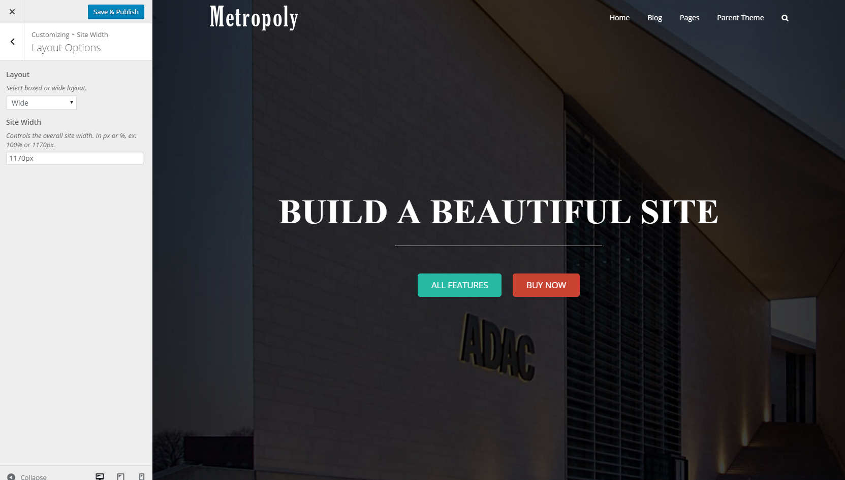
Site Width
Layout Options
You can set the site layout Wide(full width) or Boxed.
eg. Wide
eg. Boxed
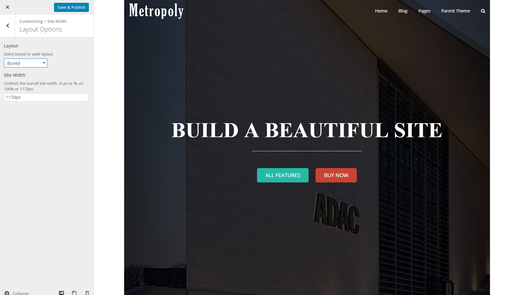
NOTICE
In this option, if you choose boxed layout, you can’t change the page content to full width independently. But if you choose wide layout, you could change the page content to boxed width independently.
Site Width
Controls the overall site width. In px or %, ex: 100% or 1170px.
NOTICE
If your site layout was set Wide, the width setting is for the content of page.
If your site layout was set Boxed, the width setting is for the overall site.
Content Width / Sidebar Width
NOTICE
These settings are used on pages (all pages except for home page) with 1 sidebar.
Content Width
Controls the width of the content area. In px or %, ex: 100% or 1170px.
Sidebar Width
Controls the width of the sidebar. In px or %.
eg. Take sample page as an example.
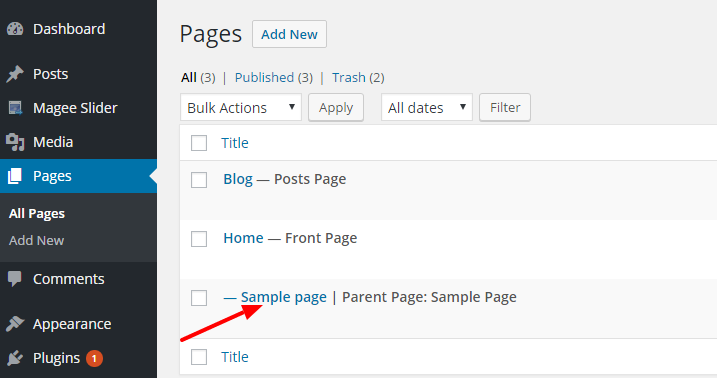
Step 1
Go to Pages in the Dashboard, Click on ‘Sample page’
Step 2
Scroll down to Metropoly Metabox Options
Step 3
Open ‘Page Layout’ option lists, choose Left (or Right as you like) sidebar
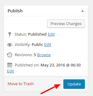
Step 4
Click ‘Update’ button, then refresh the page
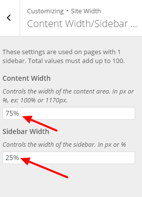
Step 5
Go to the customizing section, set Content Width as 75%, Sidebar Width as 25%, click Save & Publish button
Step 6
Refresh the previous page, you will get page layout like this
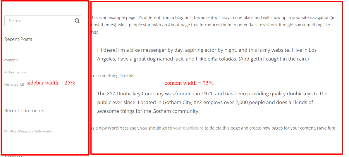
NOTICE
Total values must add up to 100%.
Content Width/ Left Sidebar Width/ Right Sidebar Width
NOTICE
These settings are used on pages (all pages except for home page) with 2 sidebars.
Content Width
Controls the width of the content area. In px or %, ex: 100% or 1170px.
Sidebar 1 Width
Controls the width of the sidebar 1. In px or %.
Sidebar 2 Width
Controls the width of the sidebar 2. In px or %.
eg. Take sample page as an example.
Step 1
Go to Pages in the Dashboard, Click on ‘Sample page’
Step 2
Scroll down to Metropoly Metabox Options
Step 3
Open ‘Page Layout’ option lists, choose ‘Both Sidebar’
Step 4
Click ‘Update’ button, then refresh the page
Step 5
Go to the customizing section, set Content Width as 60%, Left Sidebar Width as 20%, Right Sidebar Width as 20%, click Save & Publish button
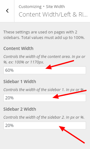
Step 6
Refresh the previous page, you will get page layout like this
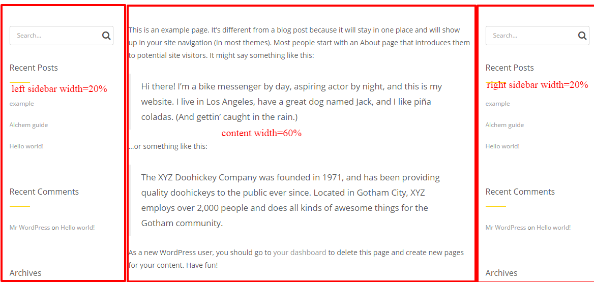
NOTICE
Total values must add up to 100%.
General
Custom CSS
The custom css section is set for those css advanced users, if you are not good at css, just leave it at default value. The css code will be added to the header before the closing </head> tag.
Styling
General
Primary Color
With the adjustment of this one setting, you can completely change the look of your site. Metropoly supports changing global color via one simple click, and the color picker will help you find the color you prefer easily. Primary color controls the main highlight color throughout the theme. Yet notice that most of the time, changing primary color only affect default color, those you had specified can’t be changed because of the css priority.
Background/ Element/ Font/ Main Menu Colors
Color settings can refer to our previous guide on color selector.
As to Background Opacity, Opacity only works with header top position (include sticky head) and ranges between 0 (transparent) and 1.
Header
Top Bar Options
Top Bar is one section that is always floating above the header and banner section.

1. Display Top Bar
YES-go on with the rest settings below
NO-just stop here
2. Background Color
Set background color for top bar. Detailed description you can refer to our previous guide on color selector.
3. Left/ RightContent
Select which content displays in left/ right content area.
Metropoly offers defaulted content like ‘info’ ‘SNS’ ‘Menu’, you can choose from the dropdown list which one shows in the left/ right content area (you can also choose ‘none’ to show no content in either left or right content area).
4. Info Content
Input relevant messages you wanna show as Info.
5. Info Color
Set font color for Info message.
6. Menu Color
Set font color for Menu part.
7. Social Title/ Icon/ Icon Link
Metropoly provides at most 9 SNS symbols for your choice. You can set them one by one.
7.1 Social Title
Input name of the SNS symbol, which will display in tooltip.
7.2 Social Icon
Insert font awesome icon here, more icons can be found at FontAwesome Icons.
7.3 Social Icon Link
Insert a link to show this icon, that’s when you click the icon, it will turn to where your added link points to.
8. Social Icon Color
Set color for social icons.
9. Tooltip Position for Social Icons
Controls the tooltip position of the social icons in top bar. Left, Right and Bottom. That’s when your mouse moves across the icon, icon title shows by left/ right or from the bottom.
Tips
More social icon name you could get from fontawesome
NOTICE
For social icons to appear on your top bar, you must enable it and have the appropriate social icon links set in the Social Icons tab.
Header Options
1. Header Style
Two header style for your choosing.
Style 1-menu float right off the logo.
Style 2-menu float below the logo.
2. Header Overlay
Header Overlay means you could set the header floating over the banner section.
If YES
The header section floats over the banner section with transparent background like below.
If NOT
The header section floats above the banner section with transparent background like below.
In this way, you will have to set header background image to avoid visual blank caused by defaulted font color.
3. Header Background Image
You can upload files from your computer or you can simply choose one from the media library.
4. 100% Background Image
Click ‘YES’, the header background image will display at 100% in width and scale according to the browser size.
Click ‘NO’, the header background image will display its original size.
5. Parallax Background Image
Turn on to enable parallax scrolling on the background image for header top positions.
NOTICE
If YES, Background Image defaulted no-repeat.
6. Background Repeat
Choose whether and how background image repeats
‘repeat’ — repeat background image
‘ repeat-x’ — background image repeats along the X axis
‘ repeat-y’ — background image repeats along the Y axis
‘no-repeat’ — no repeat of background image
7. Header Top Padding & Header Bottom Padding
Enter a numerical value to set Header Top Padding & Header Bottom Padding. In pixels or percentage.
8. Main Menu Dropdown Width
Controls the width of Main Menu Dropdown Menu, In px only.
9. Tagline
When you choose header style as ‘style 2’, you could write some tagline in the option below. Both text and Html codes are allowed, notice that the default font color is black, be careful when you got header background black too.
Logo
You can upload an image file of any size as your logo in 2 different areas; the default logo, the sticky header logo. This gives you the flexibility to adjust your logo depending on where it’s displayed. Metropoly is also retina ready, so there are additional options to upload a retina 2x logo for high resolution devices.
NOTICE
Metropoly allows logos to be retina ready, however they are not required to be used. If you do not upload a retina logo, then the default normal logo will be used on all screens.
Available Logo Areas
Default Logo Fields
– Upload a default logo that will be displayed in all areas (Default/Sticky) unless a unique logo is uploaded to the sticky header logo option.
Sticky Header Logo Fields
– Upload a unique logo that will only appear on your sticky header. This is optional.
How To Upload A Default Logo
Step 1
Navigate to WP Dashboard > Metropoly > Appearance >Customize >Header> Logo.
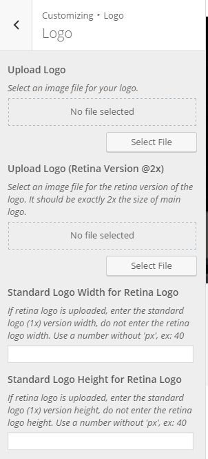
Step 2
Locate the ‘ Logo’ option and click the ‘Select File’ button to upload your logo image file.
Step 3
This step is optional. You can upload a default retina logo for retina ready devices using the ‘Upload Logo (Retina Version @2x)’ option.
Step 5
This step is also optional. If you finished Step 3, that’s when retina logo is uploaded, you can enter the standard logo (1x) version width/ height, do not enter the retina logo width. Use a number without ‘px’, ex: 40
Step 6
Click the ‘Save & Publish’ button.
NOTICE
The retina default logo dimensions must be exactly twice that of your standard logo. For example, if your standard logo is 100px x 100px, the retina version of your logo must be 200px x 200px.
Logo Options
Logo Position
Set logo position by the dropdown list.
Logo Margins
– Controls the top / right / bottom / left margins for the logo. Use a number without ‘px’, ex: 40
Sticky Header
Have you ever been at the bottom of a web page and wanted to go to another page, but didn’t want to scroll all the way back up to the top to select a menu item? With Metropoly’s sticky header, you no longer have to do that. Your main menu and logo will always be at the top of the screen, automatically following when you scroll. This makes it much easier for your viewers to quickly navigate through your site.
How To Setup The Sticky Header
Step 1
Navigate to Metropoly > Dashboard>Appearance>Customize > Sticky Header.
Step 2
To enable/disable the Sticky Header, find the ‘Sticky Header’ option and set it to On or Off.
Step 3
On this tab are also options to enable/disable the sticky header on tablets or mobile devices.
Step 4
Customize your sticky header’s appearance using the available options.
Step 5
Click the ‘Save & Publish’ button.
Tips
If your menu is too long, we suggest you not enable it on tablets or mobile phones, otherwise the end part of the menu may be invisible.
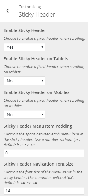
Sticky Header Options
Below is a list of all the available theme options for the Sticky Header. These options are located in Metropoly > Dashboard >Appearance >Customize > Sticky Header. Certain options are dependent, and will only be visible when specific options or header layouts are enabled.
Enable Sticky Header
Turn sticky header On or Off.
Enable Sticky Header on Tablets
Turn sticky header on tablets On or Off.
Enable Sticky Header on Mobiles
Turn sticky header on mobile On or Off.
Sticky Header Menu Item Padding
Controls the space between each menu item in the sticky header, Use a number without ‘px’, default is 0. ex: 10
Sticky Header Navigation Font Size
Controls the font size of the menu items in the sticky header. Use a number without ‘px’, default is 14. ex: 14
Sticky Logo
How To Upload A Sticky Header Logo
NOTICE
Uploading a sticky header logo is optional. If no unique logo for the sticky header is uploaded, the default logo will be displayed instead.
Step 1
Navigate to WP Dashboard > Metropoly > Appearance >Customize > Sticky Header.
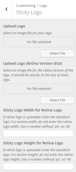
Step 2
Locate the ‘ Sticky Logo’ option and click the ‘Select File’ button to upload your logo image file.
Step 3
This step is optional. You can upload a default retina logo for retina ready devices using the ‘Upload Logo (Retina Version @2x)’ option.
Step 5
This step is also optional. If you finished Step 3, that’s when retina logo is uploaded, you can enter the standard logo (1x) version width/ height, do not enter the retina logo width. Use a number without ‘px’, ex: 40
Step 6
Click the ‘Save & Publish’ button.
NOTICE
The retina sticky header logo dimensions must be exactly twice that of your standard logo. For example, if your standard logo is 100px x 100px, the retina version of your logo must be 200px x 200px.
Page Title Bar
The Page Title Bar is the horizontal bar that sits directly below the menu/header and contains the page title text, as well as breadcrumbs, or the search box. The page title bar can be completely displayed or hidden on every page or post globally, or you can display or hide it individually per page or post. There are also numerous options to customize the page title bar.
Page Title Bar Options
NOTICE
The page title bar has global options found in the Metropoly Appearance >Customize > Page Title Bar section, and individual options in the Metropoly Metabox Options found in all pages and posts that will override global settings.
How To Setup The Page Title Bar Globally
Step 1
Navigate to the Metropoly Appearance >Customize > Page Title Bar section to access the page title bar options.
Step 2
To enable/disable the Page Title Bar for pages & posts, find the ‘Enable Page Title Bar’ option and set it to Yes or No.
Step 3
Set Page Title Bar (Mobile also) Top/ Bottom Padding, In pixels, ex: 160px.
Step 4
In the Page Title Bar panel, you can also customize other options such as Page Title Bar Background (Metropoly defaulted image or you can upload your own file), Page Title Bar Background (Retina Version @2x), that’s when you set background image for retina page title bar.
Step 5
Locate the ‘100% Background Image’ dropdown and select yes or no to have the page title bar background image display at 100% in width and height and scale according to the browser size or not.
Step 6
Locate the ‘Parallax Background Image’ dropdown and select yes or no to enable parallax background image when scrolling or not.
Step 7
Set alignment for page title by choosing Left/ Right/ Center from the ‘Page Title Align’ dropdown list.
Step 8
These settings will take effect for all page title bars on your site. To set different settings per page or post, please see the following section.
How To Set The Page Title Bar Per Page/Post
Step 1
Create a new page or post or edit an existing one.
Step 2
Scroll down the page to find the ‘Metropoly Metabox Options’ box and find the ‘Display Title Bar’ section.
Step 3
In this tab, you can choose to show or hide the page title bar per page/post, the option will take effect for the individual page or post you set them on.
Step 4
When finished, make sure to save the page or post by clicking the ‘Save Draft’ or ‘Publish’ button.
Breadcrumb Options
Breadcrumbs or breadcrumbs trail is a graphical control element used as a navigational aid in user interfaces. It allows users to keep track of their locations within programs, documents, or websites.
The right side of the page title bar can also display breadcrumbs.
How To Setup Breadcrumb
Step 1
Navigate to Metropoly > Dashboard>Appearance>Customize > Page Title Bar > Breadcrumb Options.
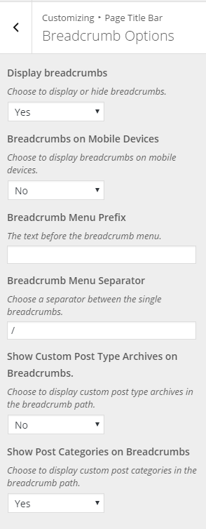
Step 2
To display or hide breadcrumbs, find the ‘Display breadcrumbs’ option and choose Yes or No.
Step 3
On this tab are also options to display breadcrumbs on mobile devices or not.
Step 4
In the Breadcrumb Menu Prefix section, you can input the text before the breadcrumb menu.
Step 5
Choose a separator between the single breadcrumbs in the Breadcrumb Menu Separator (eg. / ).
Step 6
Choose to display custom post type archives/ categories in the breadcrumb path or not.
Step 7
Click the ‘Save & Publish’ button.
Blog
No matter which method or methods you use to display your blog posts, the first thing you need to do is create the blog posts. With the ability to assign custom categories to each post, you can easily display a set of posts based on category.
How To Create A Blog Post
Step 1
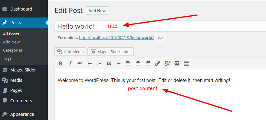
Navigate to Posts in your WordPress admin sidebar.
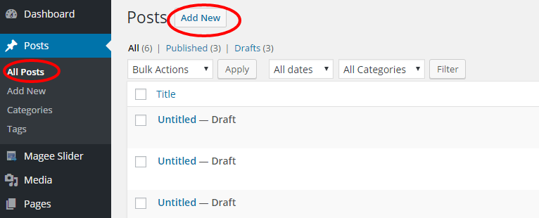
Step 2
Click on the Add New option to make a new post. Create a title, and insert your post content in the editing field. You can use any of our shortcode builder elements inside the post.
Step 3
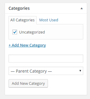
Add Categories from the right side. To assign it to the post, check the box next to the Category name.
Step 4
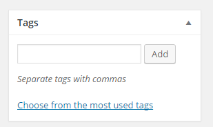
Add Tags from the right side. Type the name of the tag in the field, separate multiple tags with commas.
Step 5
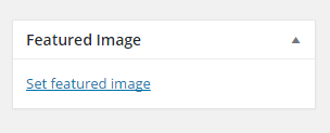
Click the Featured Image Box, select an image and click the Set Featured Image button.
Step 6
Once you are finished, click Publish to save the post.
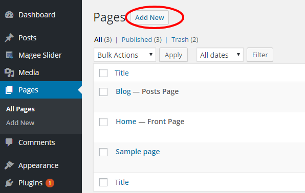
How to Set Up A Page
Step 1
Create a new page by navigating to the ‘Pages’ tab in your WordPress admin sidebar. Once here, click the ‘Add New’ button at the top of the page.
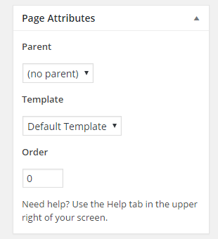
Step 2
Input a new name for your page, then find the ‘Page Attributes’ box on right side. Under the Template section, select the ‘Default Template’ option from the dropdown list.
Step 3
You can choose to customize the page using options located under the Metropoly Metabox Options below the editor. When you are done, click ‘Publish’ to save the page.
How to Assign a Blog Post Page
To set a page as your main blog page, navigate to Settings > Reading and find the ‘Posts Page’ option, then select the page you assigned from the dropdown list. Doing this will automatically pull your blog posts and place them on the assigned page.
Tips
It’s as simple as making a new page, and then telling WordPress to use that page as the post page.
When using the assigned blog page as described above, all the options you can select for it are located in Customize > Blog tab. There are dozens of options to choose from like sidebars, excerpts, full width, etc. There are general blog options, single post page options and blog meta options. Each one has titles and descriptions to help you better understand what they do. Any type of blog options you need to set will be set in Metropoly Metabox Options when using the assigned blog page.
General Blog Options
Options on this tab only control the assigned blog page in Settings > Reading, or the blog archives, not blog shortcode.
Blog Page Title
-Controls the title text that displays in the page title bar of the assigned blog page. This option only works if your front page displays your latest post in Settings > Reading, or the blog archive pages.
Blog Page Subtitle
-Controls the subtitle text that displays in the page title bar of the assigned blog page. This option only works if your front page displays your latest post in Settings > Reading, or the blog archive pages.
Blog Archive/Author/Category Sidebar
-Set the position of Blog Archive/Author/Category Sidebar
Pagination Type
-Controls the pagination type for the assigned blog page in Settings > Reading or the blog archives.
Excerpt or Full Blog Content
-Controls if the blog content displays an excerpt or full content for the assigned blog page in Settings > Reading or the blog archives.
Excerpt Length
-Controls the number of words in the post excerpts for the assigned blog page in Settings > Reading or the blog archives.
Set All Post Items Full Width?
-Choose to strip HTML from the excerpt content only.
Featured image on blog archive page?
-Choose to display feature image in blog archive page.
Blog Single Post Page Options
Every blog post you create gets a single post page. The single post page displays all the content of the post (the image, text, descriptions, etc). There are various setting for the single post page, please see below for information on each section.
Blog Post Sidebar Position
-Set the position of Blog Post Sidebar.
Display Title Bar
-Choose to display page title bar in blog posts.
Display Featured Image
-Choose to display feature image in blog posts.
Display Previous/ Next Pagination
-Choose to display previous/next pagination for single blog posts.
Display Post Title
-Choose to display the post title that goes below the featured image area.
Display Author Info Box
-Choose to display author info box below posts.
Display Social Sharing Box
-Choose to display social sharing box.
Display Related Posts
-Choose to display related posts
Blog Meta Options
Display Post Meta
-Choose to display post meta in blog posts.
Disable Post Meta Author
-Choose to disable post meta author for blog posts or not.
Disable Post Meta Date
-Choose to disable post meta date for blog posts or not.
Disable Post Meta Categories
-Choose to disable post meta category for blog posts or not.
Disable Post Meta Comments
-Choose to disable post meta comment for blog posts or not.
Disable Post Meta Readmore
-Choose to disable post meta readmore section for blog posts or not.
Disable Post Meta Tags
-Choose to disable post meta tags for blog posts or not.
Date Format
-Set date format, eg. M d, Y.
Sidebar
Metropoly offers single sidebars, dual sidebars and no sidebars for pages, blog posts, blog archive category pages, search pages. Sidebars can be assigned globally (same sidebars sitewide) or individually (different sidebars per page or post). Metropoly includes a powerful set of options to achieve this throughout the theme.
There are two sidebar dropdown fields that allow you to make selections, Left Sidebar and Right Sidebar.
Blog Posts
Left Sidebar
-Set left sidebar option that will display on all blog posts.
Right Sidebar
-Set right sidebar option that will display on all blog posts.
Blog Archive Category Pages
Left Sidebar
-Set left sidebar option that will display on blog archive pages.
Right Sidebar
-Set right sidebar option that will display on blog archive pages.
Search Page
Left Sidebar
-Set left sidebar option that will display on search pages.
Right Sidebar
-Set right sidebar option that will display on search pages.
404 Page
Left Sidebar
-Set left sidebar option that will display on search pages.
Right Sidebar
-Set right sidebar option that will display on search pages.
NOTICE
Sidebars are containers that accept widget sections. You must first create a widget section and assign widgets to it before you can assign it to a sidebar.
Background Options
Wide Mode & Boxed Mode
Wide Mode & Boxed Mode all refers to site layout type. The Boxed option will restrict your sites width to the value set in the site width option. The Wide option will display your site at the width set in the site width option.
Background Options
Background Options Only Work in Boxed Mode
Background Image For Outer Areas in Boxed Mode
-Upload an image to use for the background.
100% Background Image
-Choose to have the background image display at 100% in width and height and scale according to the browser size.
Background Repeat
-Select how the background image repeats.
Background Color For Outer Areas
-Set background color for outer areas in boxed mode.
Background Options Work For Wide Mode
Background Image For Main Content Area
-Select an image to use for main content area background.
100% Background Image
-Choose to have the background image display at 100% in width and height and scale according to the browser size.
Background Repeat
-Select how the background image repeats.
Typography
Load Google Fonts
Along with the Typography options, you can upload as many Google fonts as you want. Customize typography settings for your page with this option. Input name of the google fonts, use plus(+) to showcase the same font once font name contains more than one character. If more than one font style is needed, use vertical bar (|) to separate them.
Tips
More Google Fonts you can get from google fonts
Slider Settings
Sliders are the perfect way to catch your viewers attention by displaying your important content.
How To Set Up Sliders
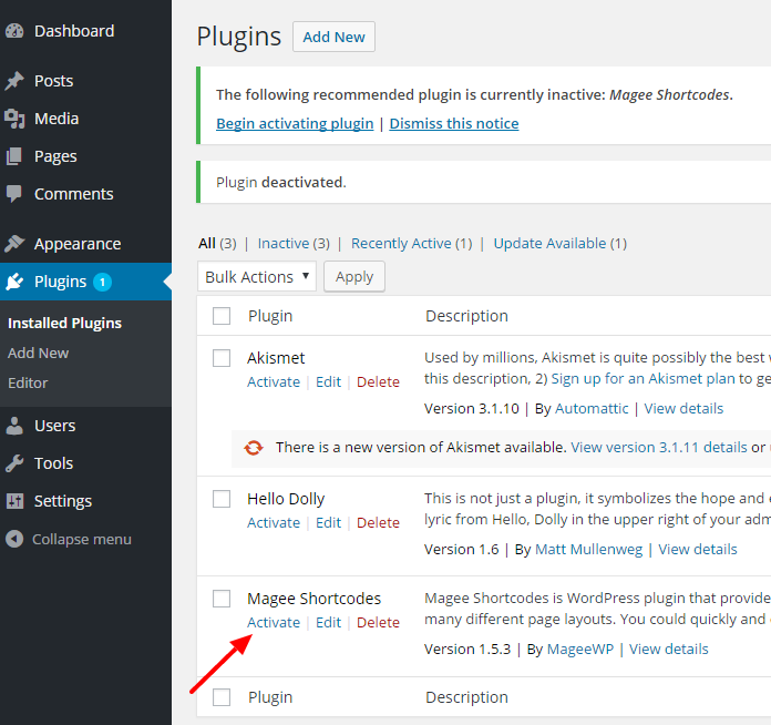
Step 1
Navigate to Appearance > Plugins section of your admin panel, activate Magee Shortcodes (installation refers to Magee Shortcodes Plugin ). Then you’ll have Magee Slider on your admin panel.
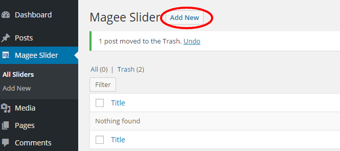
Step 2
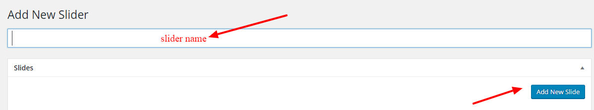
Go to Magee Slider section, click Add New.
Step 3
Input the name of your slider, and then click Add New Slide.
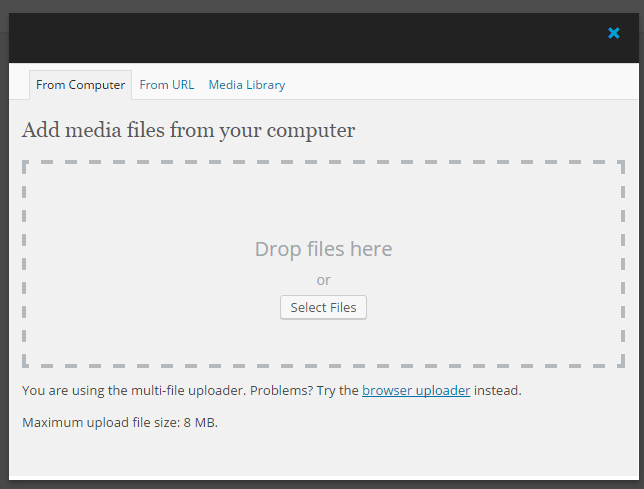
Step 4
You will then see a pop - up window like below. Add media files from your computer/ URL/ media library (no limit ) .
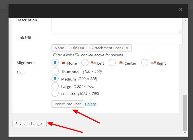
Step 5
Edit information of your selected files, then click ‘insert into post’ button.
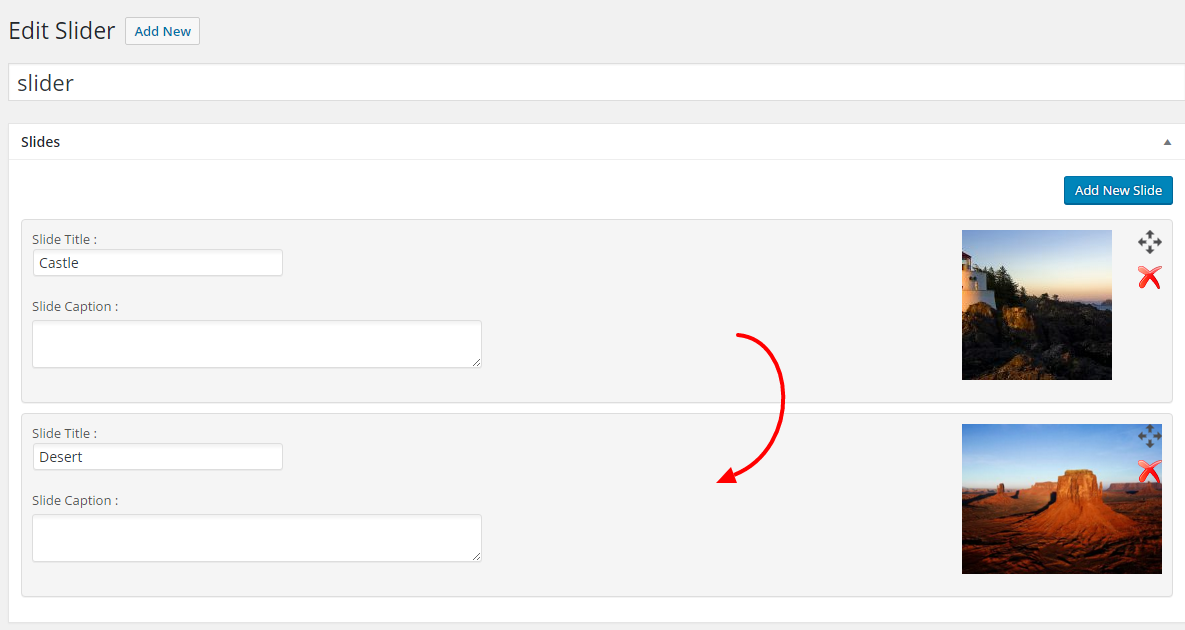
Step 6
If you wanna showcase more than one slider, go on with the previous step on slider inserting. You can also rearrange the slider order by the drag and drop functionality.
Step 7
Click Publish button on the right side.
How To Assign Sliders To Pages
Step 1
Navigate to Appearance > Pages section of your admin pane.
Step 2
Choose one page, scroll down to the Metropoly Metabox Options below the editing area.
Step 3
Set ‘Slider Banner’ as ‘Magee Slider’, you can also set Banner Position here (Above/ Below Header)
Step 4
Scroll down to the ‘Select Magee Slider’ option, choose the slider you created in the previous option above from the dropdown list.
Step 5
Click Update button on the right side.
Global Options
Autoplay
– Check this checkbox to enable the autoplay feature on the slides.
Slideshow Speed
– this option allows you to set a numerical value that controls the speed of your slide show. For example, 1000. 1000 is equal to 1 second.
Caption Font Color
– Set the color for the caption of slider, not the heading.
Caption Heading h1-h6 Font Color
– Set font color for headings in slides caption.
Caption Font Size
– Set the slider font size, ex: 16px.
Caption Alignment
– Set alignment for slides caption. Left, Center and Right at your choice.
Site Identity
Set site title, tagline and site icon. The Site Icon is used as a browser and app icon for your site. Icons must be square, and at least 512px wide and tall.
Site Title
Input your site title in this section.
Tagline
Input tagline you wanna show on your site.
Display Site Title and Tagline
Choose whether to Display Site Title and Tagline on your site or not.
Site Icon
The Site Icon is used as a browser and app icon for your site. Icons must be square, and at least 512 pixels wide and tall.
404 Page
The 404 or Not Found error message is a HTTP standard response code, in computer network communications, to indicate that the client was able to communicate with a given server, but the server could not find what was requested.
The web site hosting server will typically generate a “404 Not Found” web page when a user attempts to follow a broken or dead link; hence the 404 error is one of the most recognizable errors encountered on the World Wide Web.
404 Page Title
Insert title for 404 page. You’d better edit it in text mode.
404 Page Content
Insert content for 404 page.
HTML codes are required in this section. Keep the default structure if you are not familiar with the html codes.
Colors
Background Color
Set the color of the whole page layout, may be overlaid by section background image.
Header Image
While you can crop images to your liking after clicking Add new image, your theme recommends a header size of 1920 × 120 pixels.
Background Image
When you choose an image as the background image of the whole site, you could set the Background Repeat, Background Position and Background Attachment.
Menus
How To Setup A New Menu
Step 1
Navigate to Appearance > Menus section of your admin sidebar.
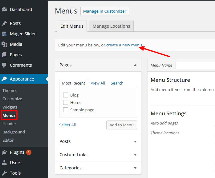
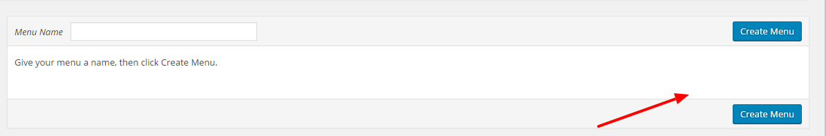
Step 2
Click the Create A New Menu link to make a new menu. Enter the name then click the Create Menu button.
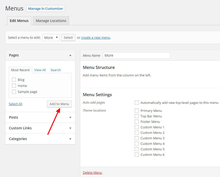
Step 3
To add a menu item, select one of your created pages on the left hand side and click the Add to Menu button. You can also add all kinds of different posts from the left side.
Step 4
To add a custom menu item, enter a custom name and link into the Links box.
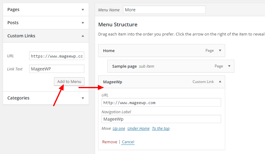
Step 5
Manage your menus by using the drag and drop functionality. To create a dropdown menu, simply drag a menu item below and slightly to the right of another menu item, and it will lock into place and create a dropdown section.
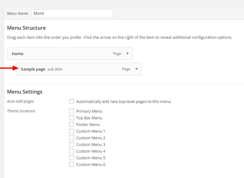
Step 6
After setting up your menu, scroll down to the bottom of the page to assign the menu to one of the 9 locations in the Theme Locations box.
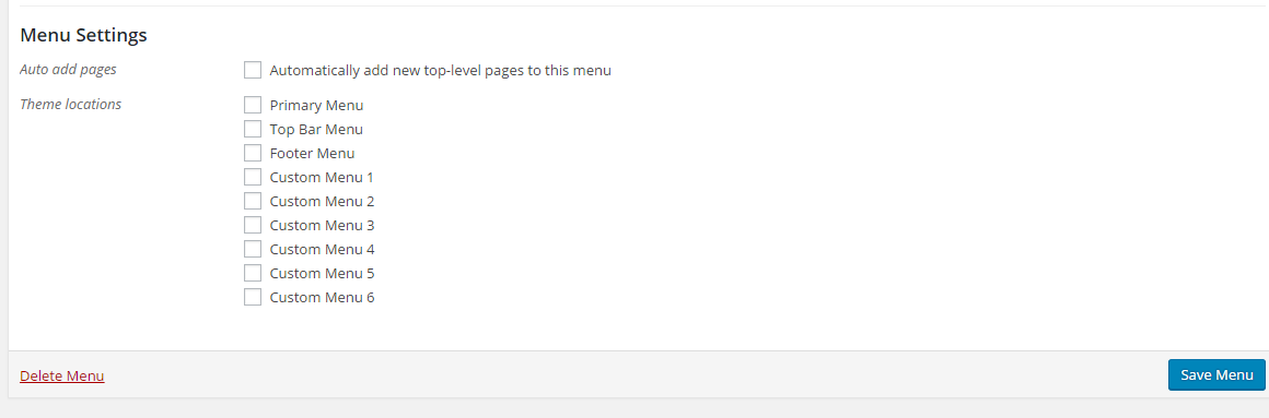
Step 7
Once its all done, make sure you click the Save Menu button.
Widgets
A WordPress Widget is a small block that performs a unique function. Widgets can then be added to widget-ready areas of the theme called widget sections.
Widget vs Widget Section
Widget
– A WordPress Widget is a small block that performs a unique function. There are several default widgets that WordPress includes such as Recent Posts or Recent Comments. Widgets will always go inside a widget section.
Widget Sections
– A Widget Section is a container that holds widgets. Widgets must go inside a widget section to be able to display on the site.
How To Add Widgets To Widget Sections
Each widget has their own options which you can customize once you assign them to a widget section.
Step 1
Navigate to the Appearance > Widgets tab to access the list of widgets and widget sections. The left hand side shows all the widgets you can use. The right hand side shows all the different widget sections you can add widgets to.
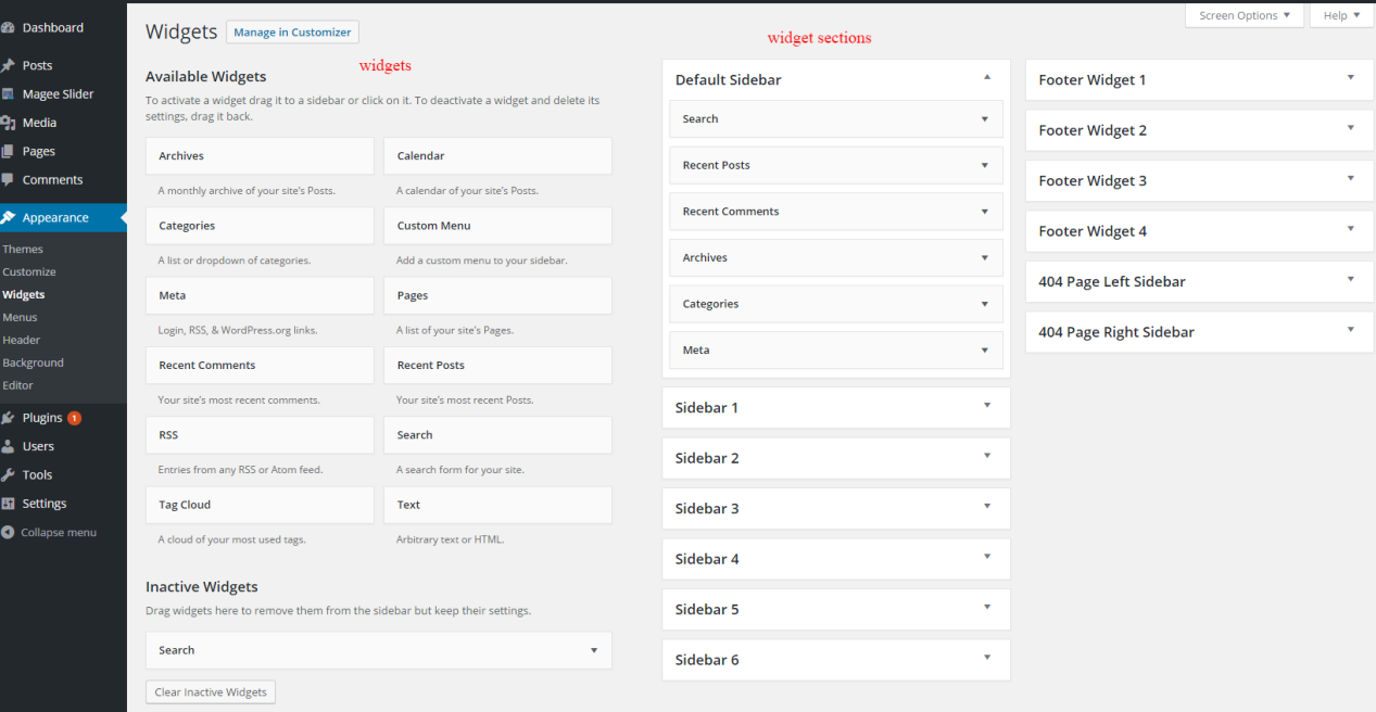
Step 2
Simply drag and drop the widget you’d like to add into your chosen widget section on the right side.
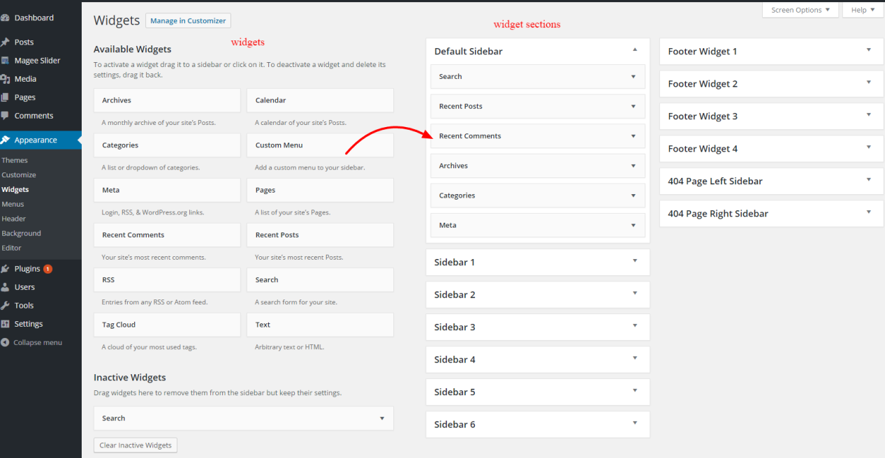
Step 3
To rearrange widgets on a widget section, just drag and drop the widgets into the order you’d like.
Step 4
You can also remove widgets by clicking the “delete” link inside the correspondent widget area.
Step 5
When finished, make sure to click the ‘Save’ button in the widget editing box to save your changes.