Enlightenment of One Page Website —Single Page WordPress Themes
Single Page Definition
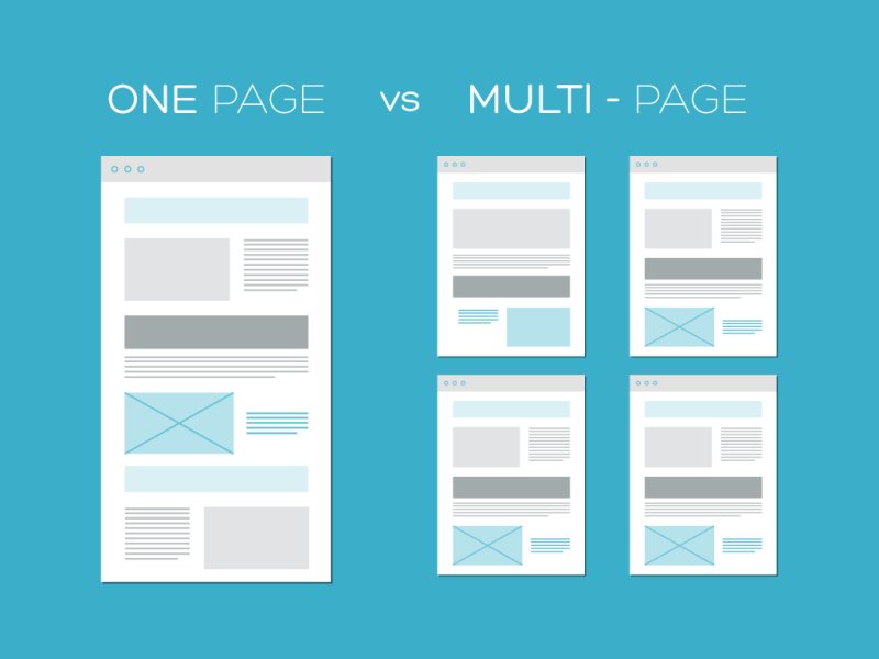
When we say single-page website, these are sites that have all the necessary contents on the same page. Instead of seeing lots of pages where you can see the site’s contents, you will only see a single page. They are all connected and you can view it while scrolling vertically or maybe horizontally. You can also click on navigation buttons which will bring you to that certain section of the same page. One page website is unique and would wow users who have seen it for the first time.
Advantages
Quality, quality, quality
If you prefer quality over quantity, then single page website is the platform to exhibit your experience. The biggest advantage is that it puts everything the customer needs in one place at their fingertips. A typical one page website has your email address, phone number, a map, a contact form, some information about the company, and some information on your product or service. All in one place. The customer doesn’t want to waste their time trying to find this information out, and with a single page design they don’t need to because everything they need is on the first and only page.
If you have only one child, he or she will get all your attention. The same happens to single page webpage design which extracts and absorbs all your creative juice in form of thoughts and ideas. Only an experienced designer can shape your creative thoughts into a work of art.
Time saving
More people are spending more time online, and they don’t want to waste the little time they have. They’ve got things they want to be doing more than sifting through pages on your site to get the information they need. If somebody’s taken the time to go to your site they want the information they’re looking for NOW. Not after they’ve finished digging down through your multi-level navigation menu system. Not after they’ve scrolled past tonnes of content that’s irrelevant to them. If they don’t find the content they need straight away they will simply leave.
By default, all a user needs to know to navigate a single page site is how to scroll. You might include arrows or other navigational clues, but with rare exception, simply scrolling will bring your visitors from one section to the next.
You’ll never have to worry about your visitors getting stuck in multiple layers of navigation, endlessly searching for what they need. The use of a header or other navigational links is often helpful if there are multiple sections on the page, but even without them, the site is usable.
Feel safe
Multi-page websites including blogs, e-magazines and news portals are like crowded cities with a complex network of roads, streets, lanes and alleys. Don’t you feel like being lost? Opt for one-page website if you don’t want your target audience to experience the same. A single page web template is one key implementation. No headache about how to direct the user from where to where.
Less clutter
When you have a single page website you are forced to concentrate on your content more. You can’t shove every little idea you think of onto the site and this forced economy will work in your favour. Your customers aren’t looking for essays, if you want to supply information to the world then start a blog and link to it from your site. What your customers want to know is who you are and what you do. For bonus points tell them what sets you apart. For even bigger bonus points do this without them REALIZING.
Similarly it frees the person creating the web design from some of the concerns that go with larger sites. It’s like taking photos in black and white rather than color: The lack of colour frees you to concentrate on the form and lighting of your photo. With a single page website design the lack of additional pages frees you to focus on what matters.
Low-key maintenance
Small house or building – which one is it easier to keep clean? The former. The same holds true about the maintenance of a single page website. Making a change or adding a feature is a lot easier than that in case of multipage websites. The maintenance is hassle free.
One page sites tend to be smaller which saves you web space and bandwidth which could very well reduce your hosting costs. A single page design is often cheaper to buy than a larger site as the designer does not need to be concerned with large volumes of content or page-specific requirements that are common with larger sites.
Eliminate mobile sites
Responsive design is, of course, not limited to single page sites. But the more complex a site is, the more difficult it is to make it work well on a smaller screen, even with a responsive design. A single-page site is, by necessity, not complex. Making the design responsive is generally easier. Simplified navigation and similar changes also make a design that works well on small screens easier.
Bold statement
Some of the least usable websites are the ones with the most information on them. Google realised this recently and made a vast overhaul to the way their search engine rankings work. Previously the advice from search engine optimization specialists was to put as much relevant content onto your website as possible. As such a lot of enormous websites appeared that weren’t especially useful to the end user. With the Google Panda update these sites were greatly penalised and dropped a lot in the search engine listings… Keeping your content concise and relevant is one way to help keep Google on your side.
A good one page website lists what people want to see up-front. A photographer would showcase some of their top work. An antiques shop might show off some of their prize sales. A singer might place her most popular song. The one page website is all about showing off, boasting a little, bragging about what you’re good at and telling the customer that YOUR company is the one they’ve been looking for.
High speed, fast loading
Empty truck or loaded truck – which one runs faster? Empty truck is a fast runner. Single page websites are just like it. It is sure to leave multipage heavy websites behind if you count the downloading time. Fast loading means users can visit your website in a very short time. What more? Reduced bandwidth means reduced cost.
A single page site can also impose certain design restrictions that speed up the process once you have a basic layout in mind. More so than a multi-page site, a single-page site has to have sections that work seamlessly together. That kind of restriction can really speed up page development once you’ve clearly defined what you can and can’t do.
Smart Google ranking
Single page website design promises a good SEO benefit – high search engine ranking. Quality inbound links are a big part of how well a website performs in search engines. While search engines aren’t necessarily the largest traffic source for a lot of sites, they’re still generally important.
The link popularity of a multipage website is distributed among the pages, thereby reducing chances for the home page to rank high. A single page website is all in all and stands good chances for good search result page ranking in Google. All the link juice will be concentrated on that page only.
By only having one page, you only have one page being linked to. That can increase the importance of the site as far as search engines go.
Full Website VS One Page Site
Benefits of Full Website
- More beneficial in terms of SEO
- No area for blog posts
- Unlimited amounts of information
- Navigation can be tricky to get a visitor to the correct page
- Best for bloggers / ecommerce stores / technical sites
Benefits of One Page Website
- Better user experience.
- Visitor can easily read the ‘story’ of your website
- Easier site maintenance.
- Easy navigation.
- All sharing can link back to the main page
- Higher conversions because of fewer steps, which lowers opportunities for customers / prospects to change their mind
- Have reduced bandwidth.
- Single page sites promote simplicity and demand concise content
- Great for conferences or events, resumes, personal branding sites
When to use it
If you’re setting up a site that would only have a handful of pages anyway, then a single page site might be perfect. Condensing everything onto one page can give the overall site a more modern look, and if it’s light on content anyway, then a single page site can make it look like it has more substance.
Another common example of the one-page site is the pre-launch website. These are, more often than not, a single page, often with a form for a newsletter sign-up. In most cases, the information provided to the public during the pre-launch can easily be organized on a single page, so it makes sense to consider this style first when designing these pages.
Single-product ecommerce sites are another place where single page sites can be great. If you’re only selling one product, whether that be a physical product or a digital one, then why bother with multiple pages? A simple, single page site can be a much better sales tool.
Conclusion
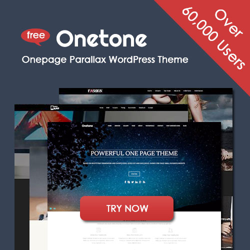
One page websites certainly aren’t for EVERYONE, but they certainly could be for a large section of the market. There are plenty of existing websites out there that are spread over many pages that could easily be condensed down to a single page. It would almost certainly benefit the site owners and the customers alike.Single page designs can be an excellent technique for tackling smaller websites, even those that you might not think could ever be done without multiple pages. Yet, the same goes with single page wordpress website, which, by making use of single page wordpress themes, can truly reach the same effects.


