Create and Style WordPress Menus
This tutorial isn’t going to cover how to create a beautiful menu, but rather how to create the base CSS code that you will need in order to make one that is beautiful, and also functional. We will be creating a pure CSS multi-level drop down menu system. One of the primary goals is too also write our CSS such that it works with the default WordPress pages menu (displayed when a user hasn’t created a menu yet) and also the 3.0 nav menus. This way the user has a flawless experience when they activate the theme.
So I’m going to show you how to write the CSS structure needed to make something like this (just the menu):
Setting Up Our Menu and its Container
The first thing we need to do is setup our menu so that we can target it with our CSS regardless of whether a nav menu is shown or a default pages menu is displayed. To do this, we wrap our wp_nav_menu() function with a DIV that has an ID of main-nav. Note, the ID can be whatever you want, but I will use “#main-nav” throughout this tutorial.
<div id="main-nav"> <?php wp_nav_menu(array('theme_location' => 'main_nav', 'container' => '')); ?> </div>
I’ve set the “container” parameter to be empty because I do not want the nav menu creating a DIV, or any other kind of wrapper, for me.
When rendered, the default page menu structure looks like this:
<div class="menu"> <ul> <li><a href="#">Menu Item</a></li> <li><a href="#">Menu Item</a> <ul> <li><a href="#">Sub Menu Item</a></li> <li><a href="#">Sub Menu Item</a> <ul> <li><a href="#">Sub Sub Menu Item</a></li> <li><a href="#">Sub Sub Menu Item</a></li> </ul> </li> </ul> </li> <li><a href="#">Menu Item</a></li> </ul> </div>
And when the 3.0 nav menu is rendered, it looks like this:
<ul> <li><a href="#">Menu Item</a></li> <li><a href="#">Menu Item</a> <ul> <li><a href="#">Sub Menu Item</a></li> <li><a href="#">Sub Menu Item</a> <ul> <li><a href="#">Sub Sub Menu Item</a></li> <li><a href="#">Sub Sub Menu Item</a></li> </ul> </li> </ul> </li> <li><a href="#">Menu Item</a></li> </ul>
Notice the lack of the div.menu container around the 3.0 nav menu. This is why we wrap the wp_nav_menu() function in our div#main-nav. Now this is not entirely necessary because we could simply specify a container element for the wp_nav_menu(), but it’s easier to do this and provides a bit more control when it comes to styling the menu. Now let’s start the CSS.
The Basic Menu CSS
The first thing we want to do with our CSS is setup the top level menu structure; we will do the sub menus in a moment. One of the things you should take careful note of is that I am using very general selectors. It would technically be more efficient to target the menu items with class names, but as I’m trying to ensure that my CSS works for both the default pages menu and the wp_nav_menu(), I need to use the general HTML selectors.
#main-nav { height: 30px; /* set to the height you want your menu to be */ margin: 0 0 10px; /* just to give some spacing */ } #main-nav ul { margin: 0; padding: 0; /* only needed if you have not done a CSS reset */ } #main-nav li { display: block; float: left; line-height: 30px; /* this should be the same as your #main-nav height */ height: 30px; /* this should be the same as your #main-nav height */ margin: 0; padding: 0; /* only needed if you don't have a reset */ position: relative; /* this is needed in order to position sub menus */ } #main-nav li a { display: block; height: 30px; line-height: 30px; padding: 0 15px; } #main-nav .current-menu-item a, #main-nav .current_page_item a, #main-nav a:hover { color: #000; background: #ccc; }
This CSS will setup your top level menu items in a horizontal row with each of the links being a clickable “block”, meaning that you can click on the space around the link, not just the text, essentially making the links buttons, not just text links. Also notice in the last section that I have used both “.current-menu-item” and “.current_page_item”; this is because the default pages menu and the wp_nav_menu() function assign different class names when the currently viewed page/item is displayed. I’ve also included the link hover in the list of selectors in the last section. This is because I want the link hover to match the “current page” status style.
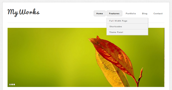
After you’ve added some of your own design styles, your menu might look something like this:
It’s now time to get into styling the first level of sub menus. The second level (and any level past that) will be very similar to this first sub menu level, but with a couple of slight differences.
#main-nav ul ul { /* this targets all sub menus */ display: none; /* hide all sub menus from view */ position: absolute; top: 30px; /* this should be the same height as the top level menu -- height + padding + borders */ } #main-nav ul ul li { /* this targets all submenu items */ float: none; /* overwriting our float up above */ width: 150px; /* set to the width you want your sub menus to be. This needs to match the value we set below */ } #main-nav ul ul li a { /* target all sub menu item links */ padding: 5px 10px; /* give our sub menu links a nice button feel */ }
That’s it for the basic sub menu styling, though notice that we have not yet done anything to show the sub menus when we hover over a parent. To do that, we have to use a :hover pseudo class, like so:
#main-nav ul li:hover > ul { display: block; /* show sub menus when hovering over a parent */ }
First, notice that I have put the :hover on the LI and not the A tag, this is because the UL is a child of the LI tag, and not the anchor link, and CSS does not have a method for selecting sibling elements. Second, take note of the fact that I use “>” immediately after the :hover pseudo class. This is because I only want to select the sub menu immediately after my menu item, not any second or third level menus we may have.
Once again, after some you have done some design CSS, your menus can now look / function like this (note the drop down):
Okay, that’s it for the first level of sub menus, and now it’s time to add a couple more styles to take care of any second and third level sub menus.
#main-nav ul ul li ul { /* target all second, third, and deeper level sub menus */ left: 150px; /* this needs to match the sub menu width set above -- width + padding + borders */ top: 0; /* this ensures the sub menu starts in line with its parent item */ }
We’re done. We now have a complete menu system with drop downs written entirely in CSS. No jQuery. One of the great things about a CSS structure like this is that it works perfectly even when you enable jQuery animations on it, without the need for any separate styles. The only thing that is left to do from here is beautifying your menu. Add some nice borders, background colors or gradients, and maybe even some CSS3 hover transitions.


