Creating the best Landing Page by effective use of Horizontal Stripe Layout
Before really going ahead with the exact way of ‘How the Horizontal Stripe Layout can be more effective in creating the best Landing Page’ let us, in short, understand the meaning of each term.
Landing Page
In Online Marketing, Search Engines play a fundamental role. The direction given by the search engine, to the user, in response to his click, on the Optimized Search Results, to the very first page of the web site, can be termed as, the Landing Page of that particular web site. Landing page is also termed as ‘Lead Capture Page’ or ‘Lander’. Usually the landing page is the probable continuation of the search links. Also it can be a continuation, of any advertisement, or a commercial, displayed in response to the search results.
Horizontal Stripe Layout
There are various time tested ways, for designing the contents of the Landing Page, viz. Grid Based Layout, Fluid Layout, Elastic, Absolute, Equated and Relative. Also some are Full Screen Photo, Side Bars, Boxes. But Horizontal Stripe Layout is considered a unique in today’s scenario for designing the landing page for various reasons.
How The Horizontal Stripe Layout Can Be More Effective In Designing The Best Landing Page?
There are two type of landing pages:
- i} Reference Landing Page - It is the landing page that gives the information like images or any text messages. Or it can give the Additional Links of the additional information required.
ii} Transactional Landing Page - In this page, the user is prompted to key in, his personal information, for the access of the website, or required service.
For both the landing pages the advantages to use the Horizontal Stripe Layout can be summarized as under:
i} Gradual Introduction - Divulging the data, gradually to the user, does not confuse him. It provides with the uniform amalgamation of the data & gives the excellent scrutiny of the information displayed for him.
ii} High Data Usage - With the horizontal stripe layout, huge amount of data can be organized, and displayed, to the user, in very small parts, thus making the user more interested, in reading, without appraising him, how much he has read. But the gist will be definitely understood.
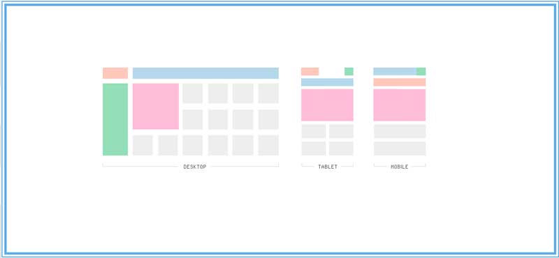
The basic foundation of the Horizontal Stripe Layout includes, adhering, to the horizontal sequence, and organizing the matter, in order to make a website, or its landing page, more unique & colorful, with increase in the intensity of the colors in the design to give a contemporary look!
Advantages of Horizontal Stripe Layout on A Landing Page
1. The main purpose of the landing page is exclusively for the marketing activity. The effective marketing tool is the basic design of the landing page. How many times the user clicks on that page, is the success of the Landing Page. And if all the information is put on the first page itself, the user will be reluctant to read the same. But in the horizontal layout, the information is popped up slowly, user can continue on the website.
2. The Landing Page can be used to promote, the service or the product and the information with regards to the same can be directed product wise or service wise by the horizontal layout in more convenient manner.
3. Collection of the database of the customers or the potential prospects. Horizontal Layout is one of best way to collect the data slowly, but surely, from the user, in the due course of his web site surfing without making him feel the burden of it.
4. Getting the feedback or opinion of the product/service/company etc.
