Onetone WordPress Theme 2.0.0 Updated
New week we present you with new update. Our free one page wordpress theme Onetone has experienced new progression, mainly on dashboard optimization, newly added function, bug fix and some optimizing work for mobile version. Below you can have a visual look of it.
General Optimization
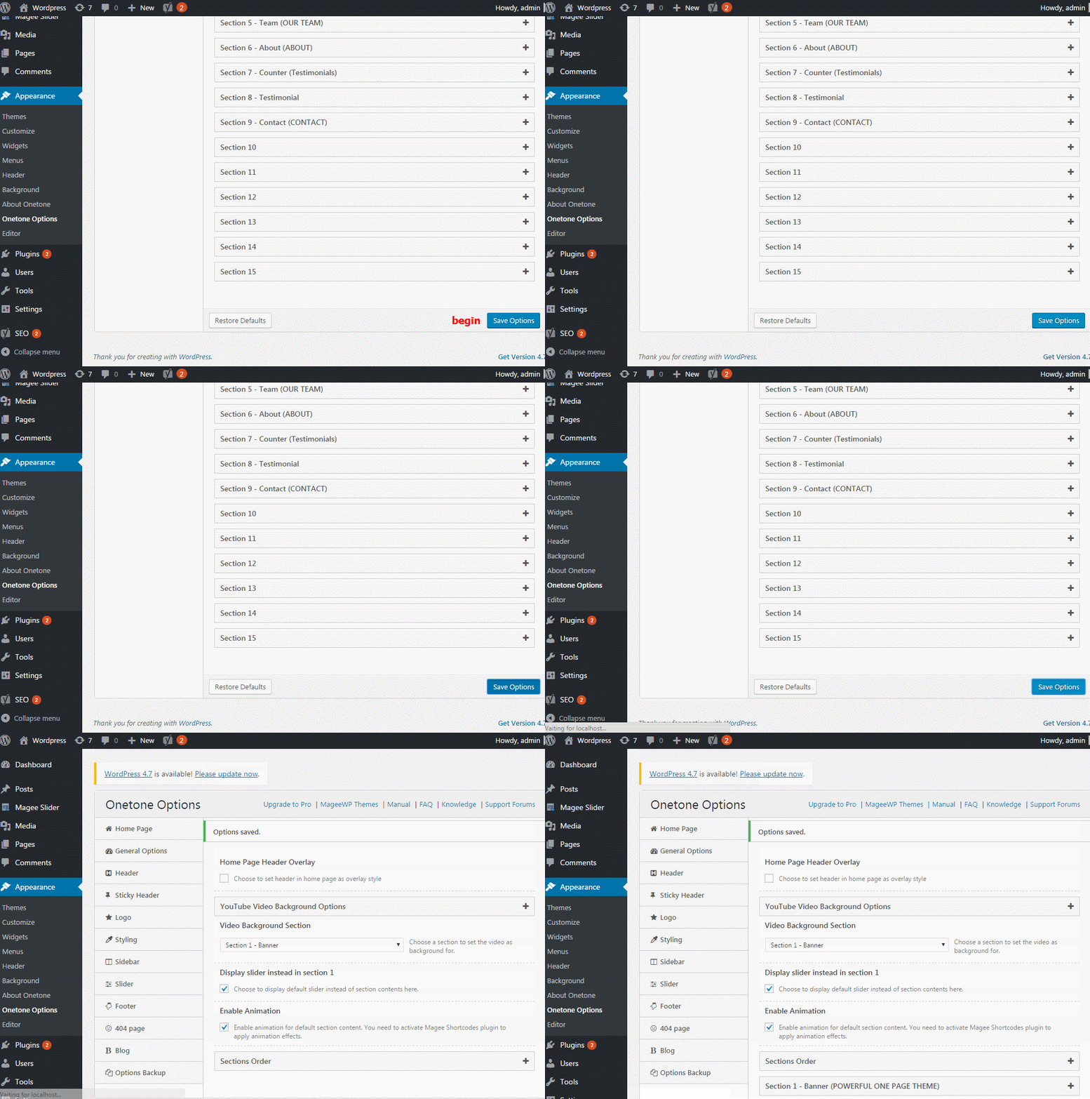
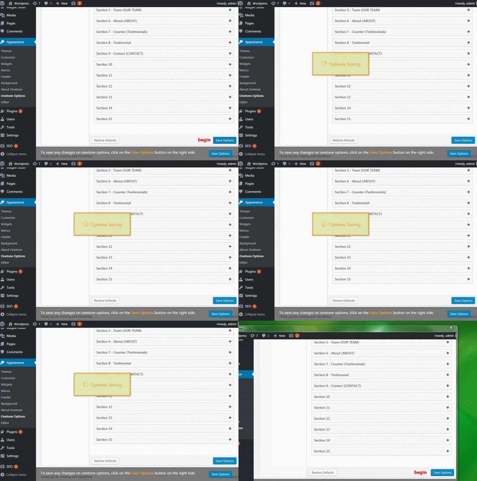
Optimized Onetone Option Save
Each time you make any changes on ‘Onetone Options’, you’ll have to click ‘Save Options’ button to save your changes. Any tiny changes, even for one index, resulted in one complete data transmission from front end to the server. Just like public transportation, more pressure, much slower, sometimes it might cause ‘traffic jam’.
After the optimization, each time you make a change, only the changed index get transmitted from front end to the server. In this way, You’ll get all changes a much faster save.
Newly Added Vimeo Video Background
Vimeo has became a fashion trend these days, and thus when we calculated this popular video version as one of our background video. Hope you enjoy it !
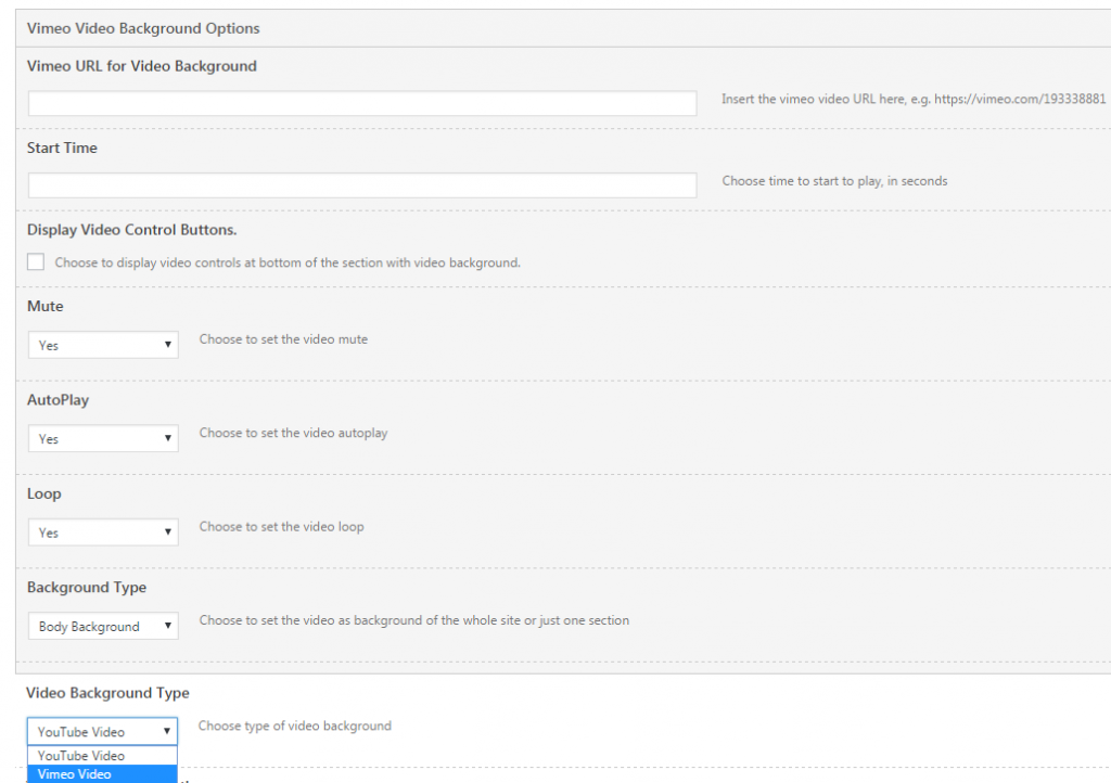
Go to Onetone Options > Homepage, navigete to Vimeo Video Background Options.
Finish relative settings, and if you wanna set video background type as vimeo video, just choose vimeo video from the dropdown list.
Newly Added Side Dot Navigation
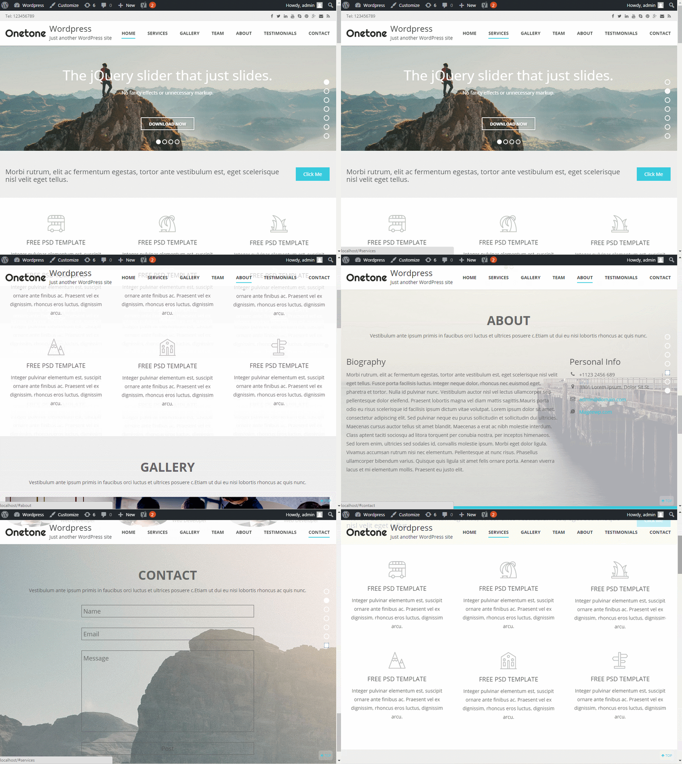
Jumping to one particular section is a real problem when you are navigating through your site. You’ll have to scroll back and down. With side dot navigation, you no longer have to do it, just choose relevant dot and click on it. This makes it much easier for your viewers to quickly navigate through your site.
Go to Onetone Options > Homepage, check ‘Enable Side Navigation’ checkbox. You’ll then get a side dot navigation like below.
NOTE
For pro version, users can set side dot navigation color for each section respectively. Go to Onetone Options, navigate to one section
Select the color you wanna display.
Mobile Version Optimization
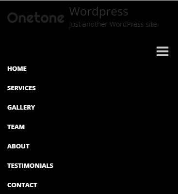
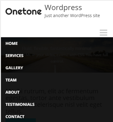
Transparent Menu Style
Before, the menu area may block a part of the page, which may be inconvenient
Now, users can check the menu area with a visual impression of the page
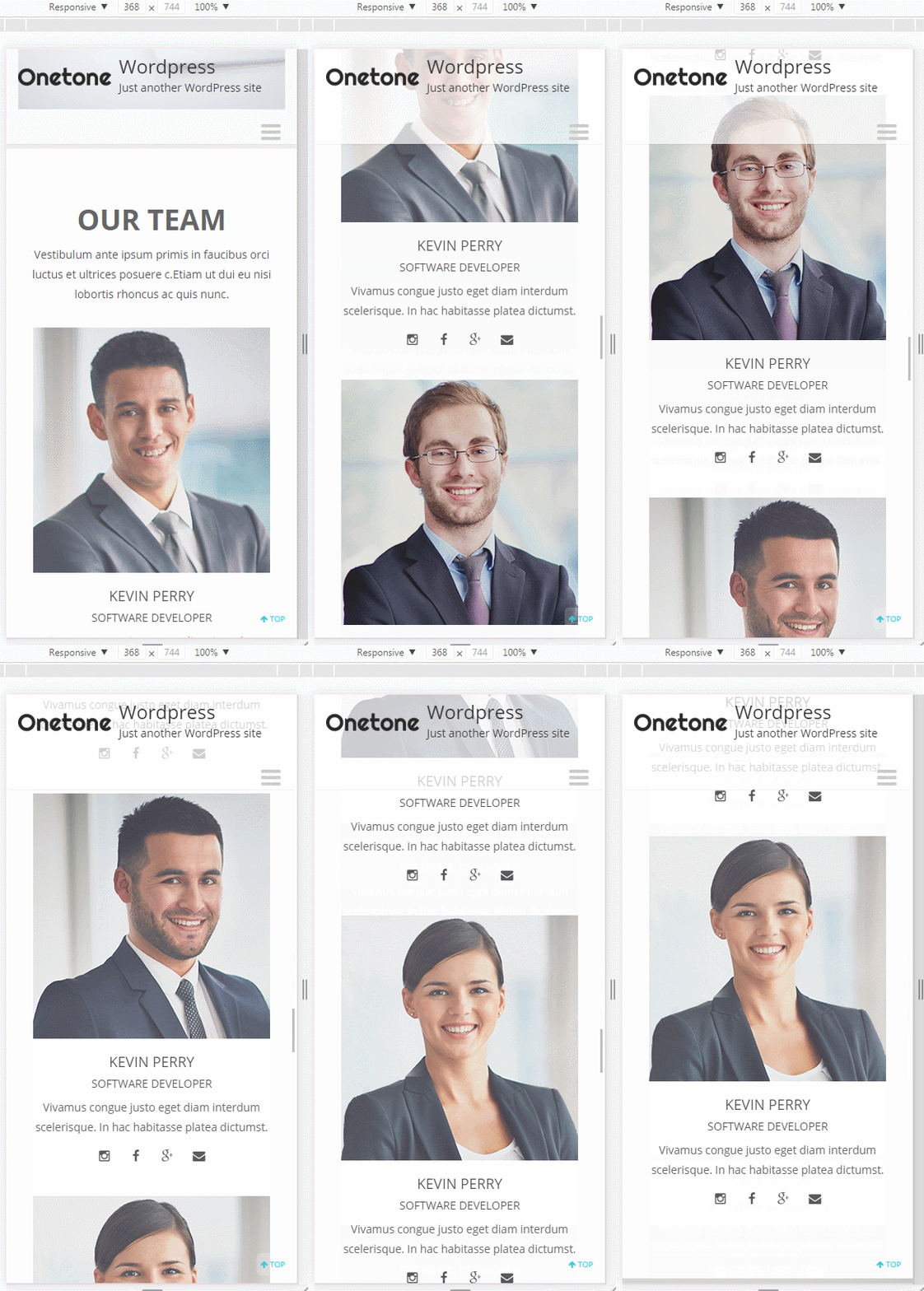
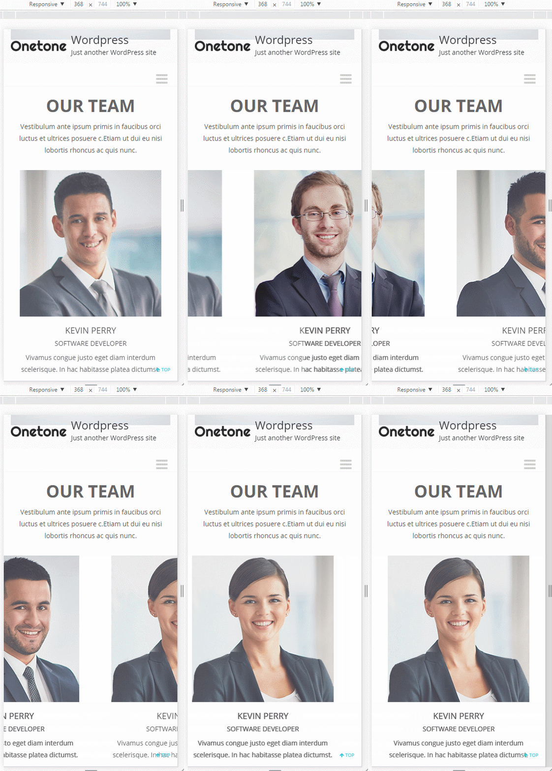
New Display Style ( Section Team & Testimonial )
Before, you’ll have to scroll the navigation bar to view each part of the section.
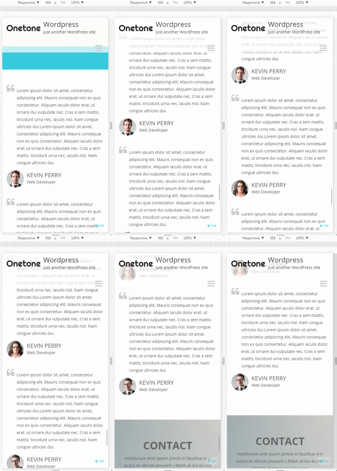
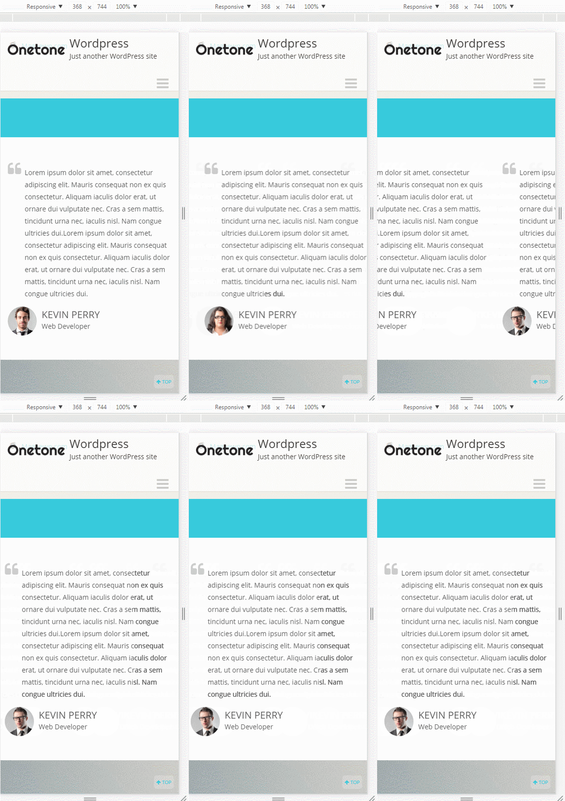
Now, just slide. It can both save your time and make it more simple for mobile users.
SECTION Team
SECTION Testimonial
Blog Page Bug Fix
Title Bug
The whole title area was clickable, which may cause some problem.
Breadcrumb Bug
No breadcrumb
 With breadcrumb, users can keep track of their locations
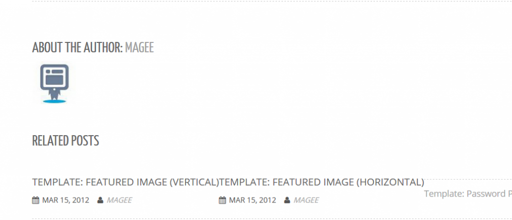
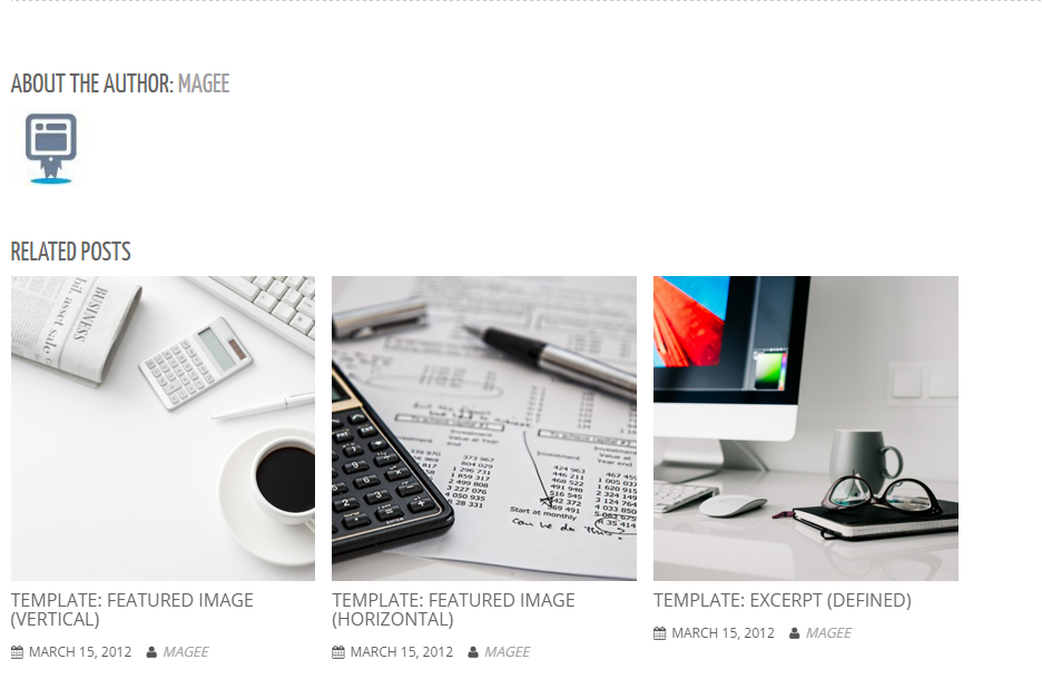
Related Posts Bug
Some dislocation problem
Now
