Make Your WordPress Site Attractive
About
As the most popular content management system amongst bloggers, developers, and SMEs, WordPress websites are viewed by over 409 million people each month. These views come from a variety of sources including marketing campaigns, direct URL entry, and a number of other methods for searching online.
However, people get bored and disinterested within seconds these days. As quickly as technology is changing and as fast as other people in your industry are popping up websites, yours must stand out and look better than the average (at the least).
Tips
Update Content
There’s nothing more frustrating than visiting a website for instructions, advice or a service just to find that the “most recent” thing listed on the website. You need to be keeping your website fresh with the latest products, options, industry standards, etc. You must present yourself as the expert in your field. Have you ever visited a website that has a Christmas special listed on their home page, but you realized it was April. Would you feel as though this company was up-to-date with their business or that they even cared? What kind of content should you put on your website?
Be sure you can update your website’s content consistently (weekly if possible).
Use Customizable Themes
If you don’t feel like learning how to code to have some creative control over your WordPress site,or hiring a professional developer, one of the best things you can do is choose a theme with design options. But when it comes to allowing you the freedom to customize your theme – no coding required – to stand out from all the other users of said theme, not all themes are created equal. There are a lot of themes that allow for almost 0 customization outside of the customization options built into WordPress (which is actually not that much).
Use A Logo
One of the more standard ways of differentiating a WordPress site from others that use the same theme, to make a site your own, is to use a logo instead of the standard headline text + font. If you’re on a tight budget, or you just like having the you can for example make your own, text only logo. Which might sound underwhelming, but by carefully selecting fonts and colors, you can create a very professional looking logo yourself.
Offer Connect Ways
It’s a good one to consider when you’re trying to make your WordPress website look better. You might have a Contact Us page, but the text for the link to the page is the same size as all the other navigation options or maybe even buried in the footer area of their website. Give your visitors several ways to connect with you. Have your Call to Action (CTA) big on every page and perhaps even a different contrasting color that will help it POP off the page. List your social networks on your website so that those who love Facebook can engage with you there, and those Twitter fans can tweet with you.
Give you customers an easy avenue to connect with you – and they will.
Design Responsively
What is the difference between the design of a really amazing website and one that looks ugly and uninviting? Below we outlines some design elements and principles that will transform your design from okay to extraordinary.
White Space / Good Organization
A very important foundation of good web layouts is the use of organization and whitespace. Your design should not be haphazardly thrown together without any purpose. Every element placed on the page must have a reason for being exactly where it is. Whitespace is an important part of this organization.
Numbers/Data turned to Illustrations (infographics)
One thing that can turn a website from being slightly helpful to absolutely compelling is the use of Infographics.
A great infographic will quickly present your users with the info they need in a way that is easy to understand, and actually meaningful and worthwhile. Notice how this infographic gives meaning to otherwise abstract statistics.
Large Typography
One thing that many great websites have in common is their use of large font sizes. The use of large text on your websites will help you as a designer narrow down what the perfect wording is. Since your words are bigger, you have less room for extra “verbage” that your readers don’t want anyways.
Another helpful thing about large fonts is they allow you to quickly scan pages to get the main message of the article or website.
Contrast between Elements (Color Differences)
When designing a website, one of the most important principles of great design is choosing a color scheme that accurately portrays the mood of the company/individual. Not only do your color choices need to portray this mood, but they also need to provide contrast between different elements in your design.
Directional Arrows to Guide Readers
Sometimes simple arrows and color changes can make navigation through your website easier to follow. Especially when talking about a progression of things that happened, you need to give your users visual cues of what is going on.
Simple but Compelling images
Images are very powerful – they have power to cause action, change moods, and create feelings.
Large User Friendly Buttons / Navigation
With the advent of touch screens, it has become necessary to make navigation buttons larger to accommodate the fingers of website users. Make sure that people can easily navigate through your site without clicking on things they weren’t meaning to.
Creative Icons
When navigating a website, simple icons that explain things can really be a help to your users. As designers we instantly recognize the little “Ps” icon among our programs as Photoshop. When browsing the web, the little blue bird instantly informs us that we can tweet about the page we are viewing.
Hoverable Items
There is something about simple interactions that makes us feel more connected and involved. It may be a simple hover in a navigation element, or maybe a creative animation between photos in your portfolio. Whatever the case, make sure the animation is simple, fast, and user friendly.
Work Out Social Sharing
Some customers will visit a website and see that there’s nothing new happening on the site, so there’s no reason to return. But imagine if you mentioned the fact that “Every week we offer a new exclusive special or coupon.” People would bookmark your website in their favorites and visit often to find deals and to share the site with their friends.
What if you shared a new article every week – like we do here. Then as soon as you’ve written it – send the link out on all of your social media and share it with your networks driving traffic back to your website. You could even send out a monthly newsletter email sharing all of your latest articles. All of this is to drive traffic to your website.
Add Wow Factors
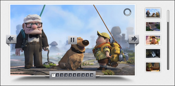
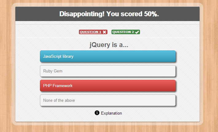
WordPress websites these days are pretty easy to detect by just their look. The templates tend to smash a logo that has to fit into a designated area and there’s typically a slideshow on the home page. Scrolling down you’ll find three columns below highlighting your services followed by some dynamic list of your most recent blog posts or a Twitter feed. Why look like everyone else? You need to have some sort of “Wow” factor that will make your website be memorable to your visitors. This could be a great video. This could be an interactive form that they can fill out and get something instantly for free.
Use Widgets/Sidebar
Another easy way to change the look and feel of your website, is by placing key visual elements in the sidebar. These can be self-designed mini-banners, or simply good looking and useful widget plugins that fit well with the rest of your site’s design. For example a widget plugin that showcases popular posts and shows their featured images. Checkout the WordPress.Org plugin repository – they have tons of great free widget plugins that you can use to change up your website look.
Create A Custom Homepage
By using a page builder, you can totally change the first impression a visitor gets when he/she visits your site. Page builders make the process of creating a custom website manageable for WordPress users who aren’t developers. The Visual Composer is by far one of the most popular page builder WordPress plugins available, and with good reason. The easy to use interface allows users to build pages on the front-end, so you can see your page on your live site as you’re building it (this includes actually seeing color selections, columns, excerpts, sliders and more all live as you tweak them).
Keep It Clean
One of the things many people do wrong when they try to personalize their website, is that they add a lot of unnecessary elements, instead of changing a few of the preexisting key elements of the design, to better align with their own brand and vision.
Your site doesn’t have to be complex to look good. In fact, in most cases, it’s the exact opposite. Cluttered, and too complex, websites are seen as uglier than simple, easy to follow ones. This means that even if you have the option to go for 4 side-bars, or stick your logo 8 places, maybe just stick with the one.
Make Use of Plugins
WordPress has several built-in options to help increase your search engine ranking. In addition to those options,
we’ve rounded up five plugins to help increase your search engine optimisation (SEO) even further.
- Yoast – a Solution for (Almost) Everything
- SEO Friendly Images
- All in One SEO Pack
- WordPress Popular Posts
- LinkPatrol: Control of Outbound Links

